Designing a Regional Wine App
Skip to Hi-Fi

❗Problem
While Armenia claims to be the oldest wine-producing country, there's no easy way for people to discover local wines or industry updates. This leads to less interest and awareness of local wine heritage and market.
👑 My Role
I was hired as a freelance designer to conduct research and iterative usability study, facilitate ideation workshops, design the interface, prototype, and ensure quality control during implementation.
🎯 Research Goals
To reach our goals, we had to understand the problem first. After identifying what we didn't know and discussing it to my stakeholders, I set the research goals. These goals helped us decide on the research methods and plan them properly:
What challenges do people encounter when searching for wine in Armenia?
What factors influence users' decisions when choosing a wine?
-What are users’ motivations, aspirations, and desires around wine?What existing solutions do users have for accessing wine information and updates?
- What sources do users trust for information about Armenian wines and industry updates?
Research Methods: Survey, Contextual Inquiries, Desk Study, Competitive Analysis
⚖️ Competitive Analysis
I didn't find a direct competitors with the same value proposition as Wino or one that fully solves our problem statement. However, I found various solutions that address different aspects of our problem.
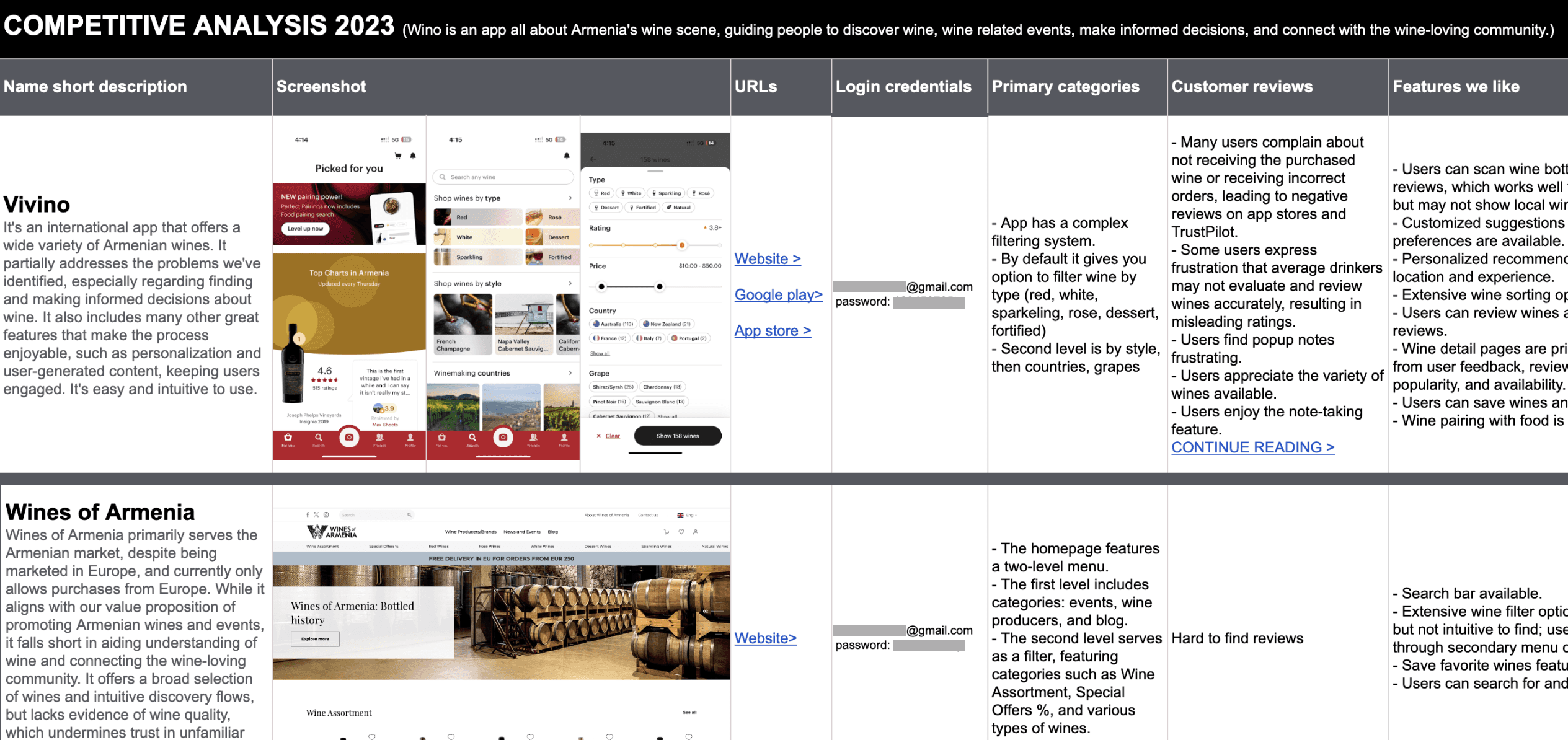
Screenshot from the competitive analysis, translated from Armenian.
💬 Contextual inquiry
Before the interviews, I created a screener based on user personas and research questions, involving team members and personal contacts to circulate it. I chose 15 participants for semi-structured interviews, selecting 5 from each persona hypothesis.
Interviews were conducted in person at In-Vino, a local winery. After the interviews, we simulated a wine purchasing process at In-Vino and the nearby supermarket Nor Zovq.
Here is the affinity diagram for the 'Ani, wine newbie' persona interviews.
❗Key Insights
After analyzing all the research findings, I invited colleagues to discuss my categorized results. Together, we turned this knowledge and data into insights.

🎨 Storyboarding insights
I did storyboarding twice. First, I mapped out the pain points identified from our research. This helped us in our HMW workshop to discuss which steps in our personas' journeys we can support and identify opportunities for the company. Here is an example of one of the eight different storyboards.
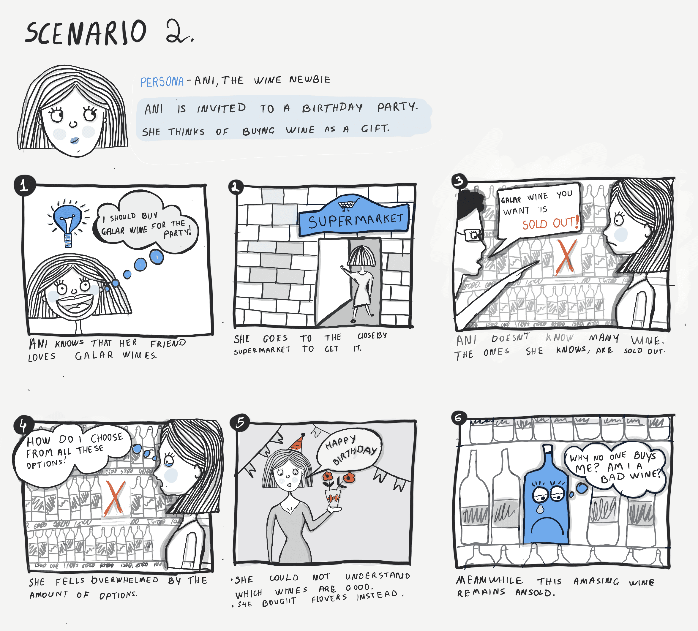
Translated from Armenian.
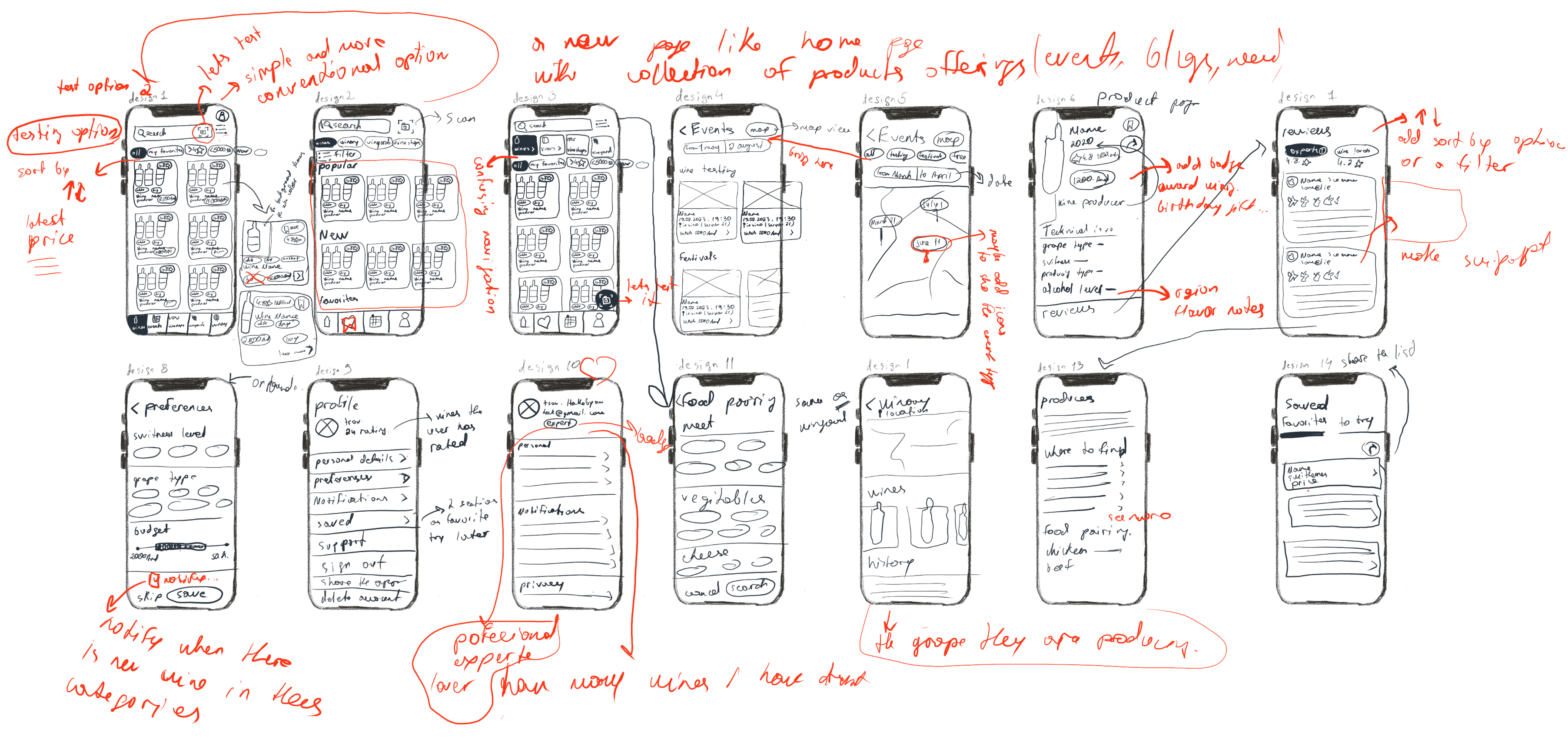
✏️ Sketches
Before designing in Figma, I led several rounds of sketching workshops. Since the project was large and complex, this step alone took a whole week. We started by sketching basic layouts, then moved into detailed design patterns or drawing inspiration from pattern research.
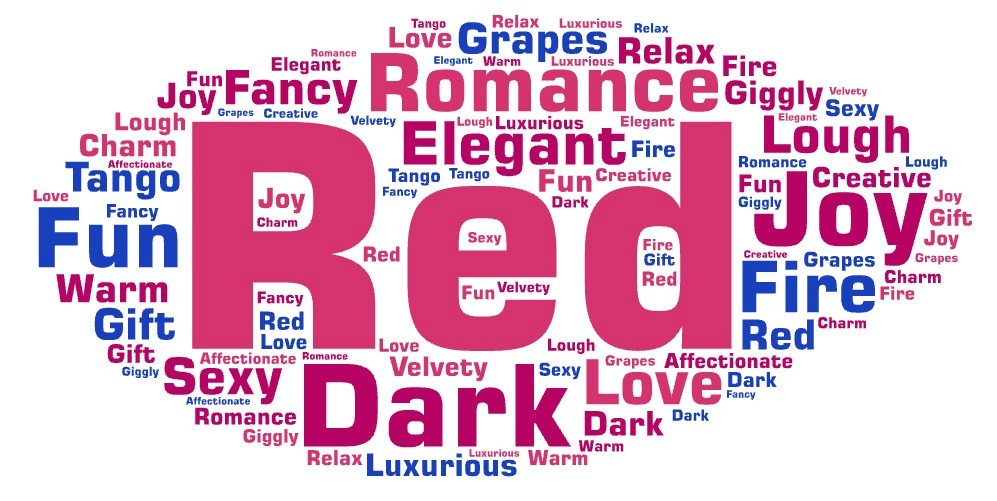
🍷 Mood-Board
During our contextual inquiries, we asked participants to pick three words they associate most with wine. From 15 people, we got 45 words, forming a word cloud where the biggest ones showed up most.
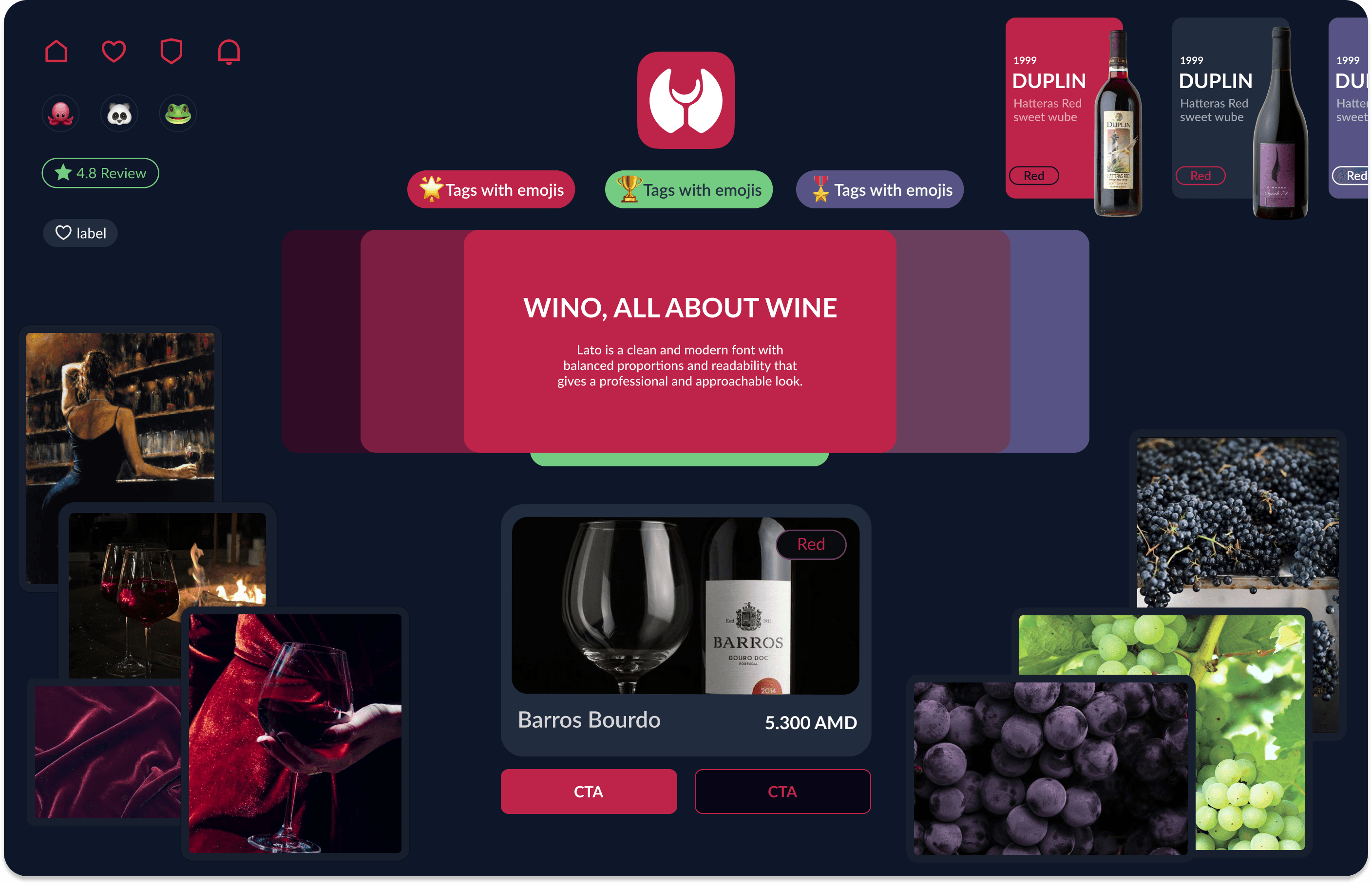
Then, with branding and marketing experts, we made a mood-board inspired by these words. With the dark mode and red, we aimed for an elegant and romantic vibe, while emojis and rounded edges added some fun and joy to our UI direction.
Translated from Armenian.
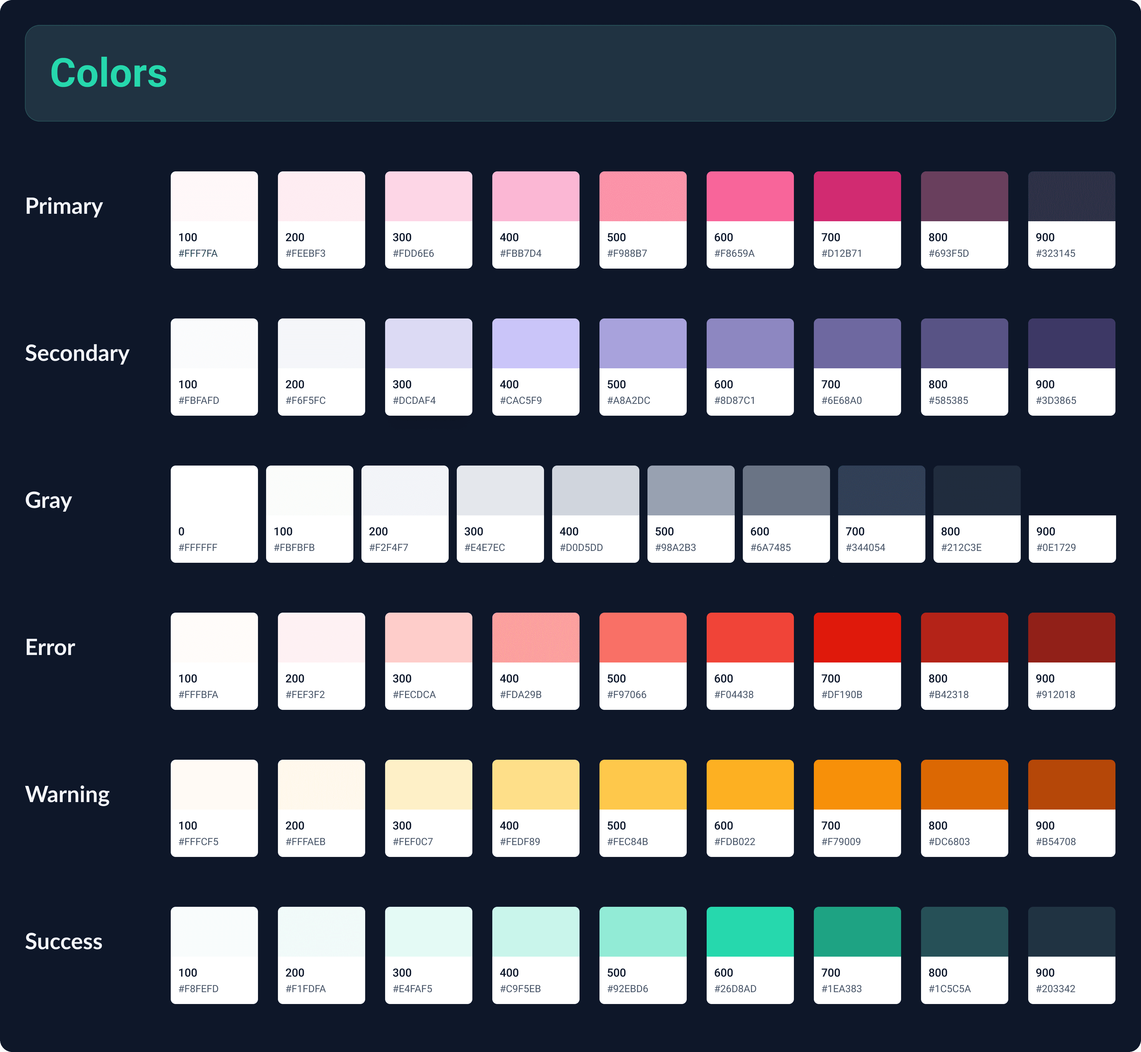
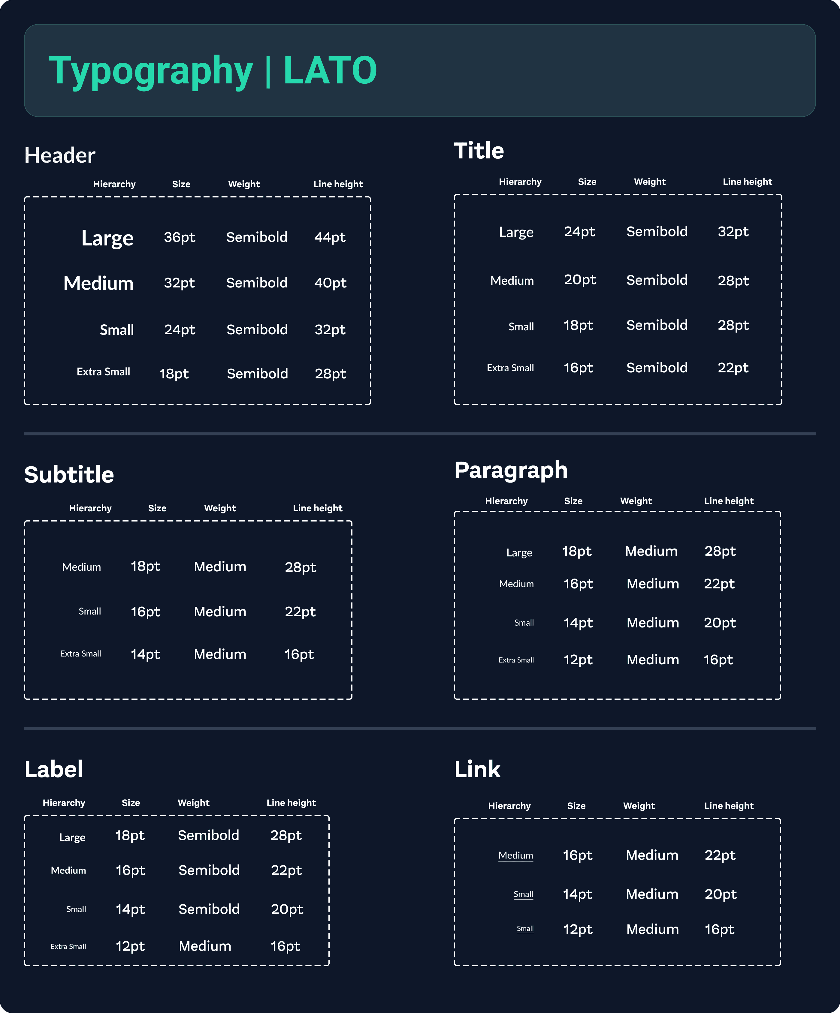
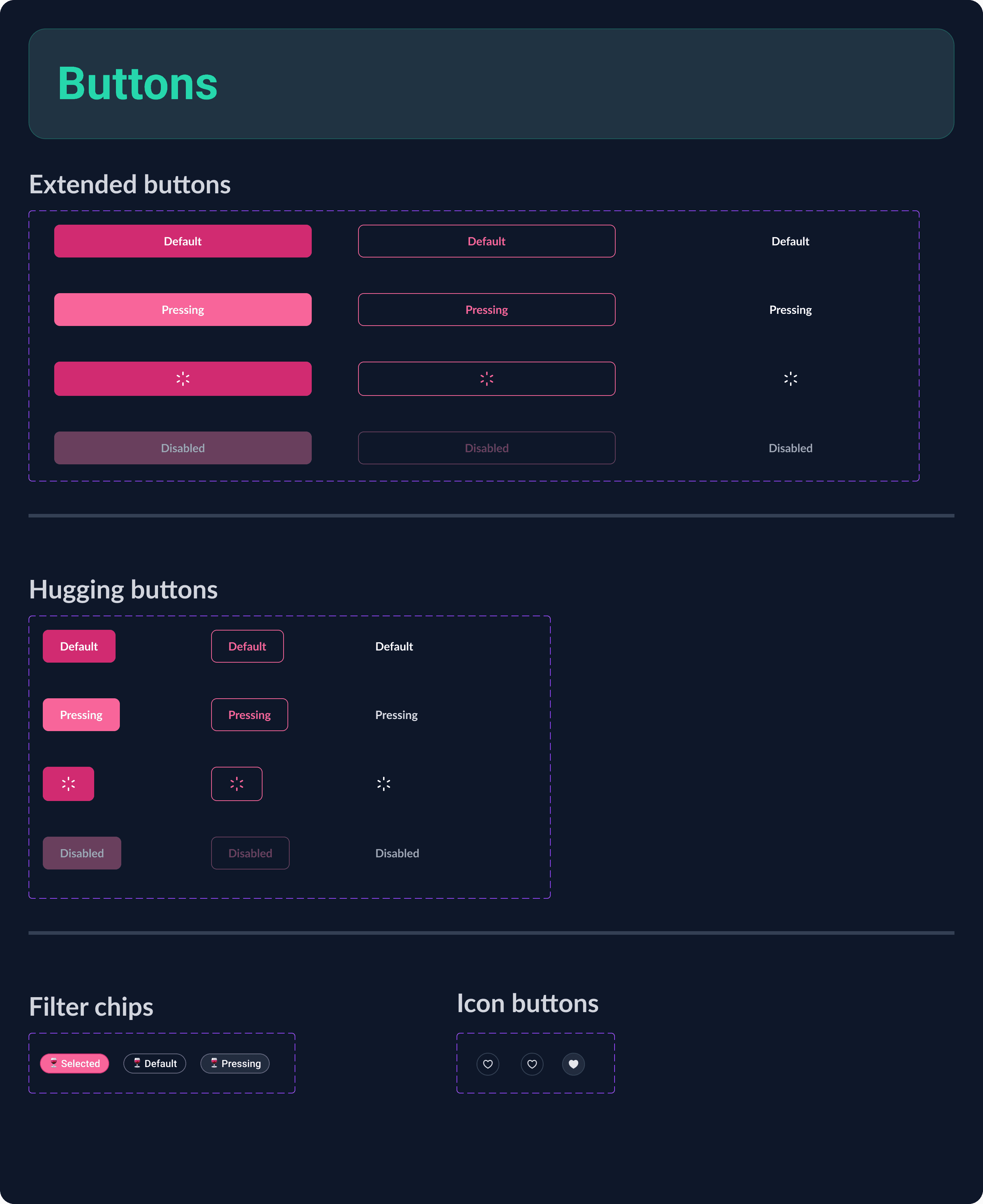
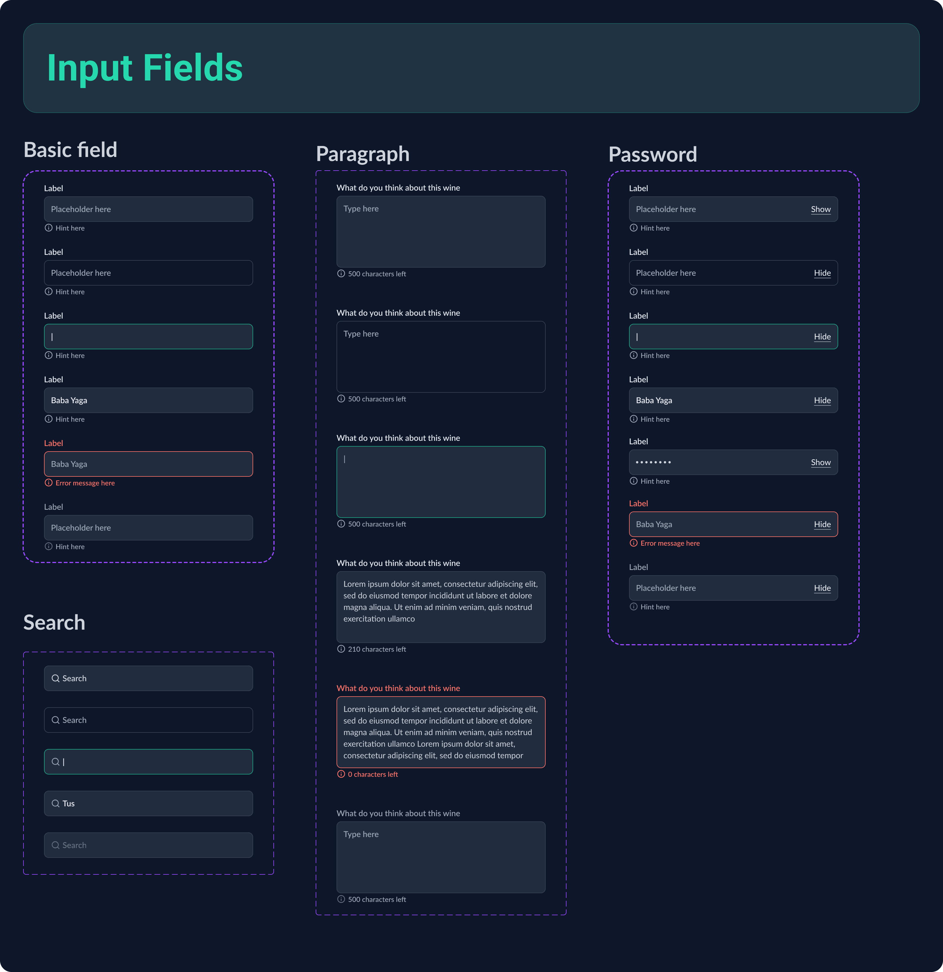
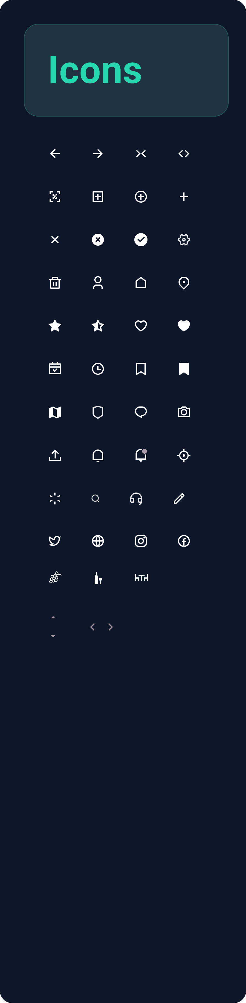
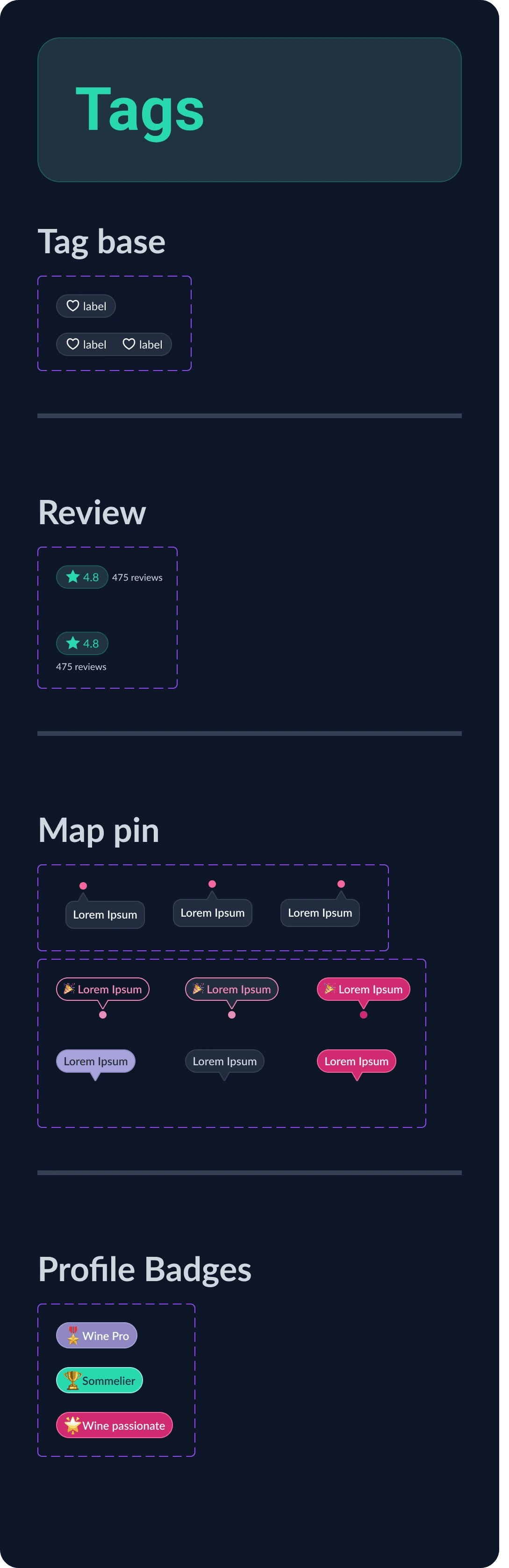
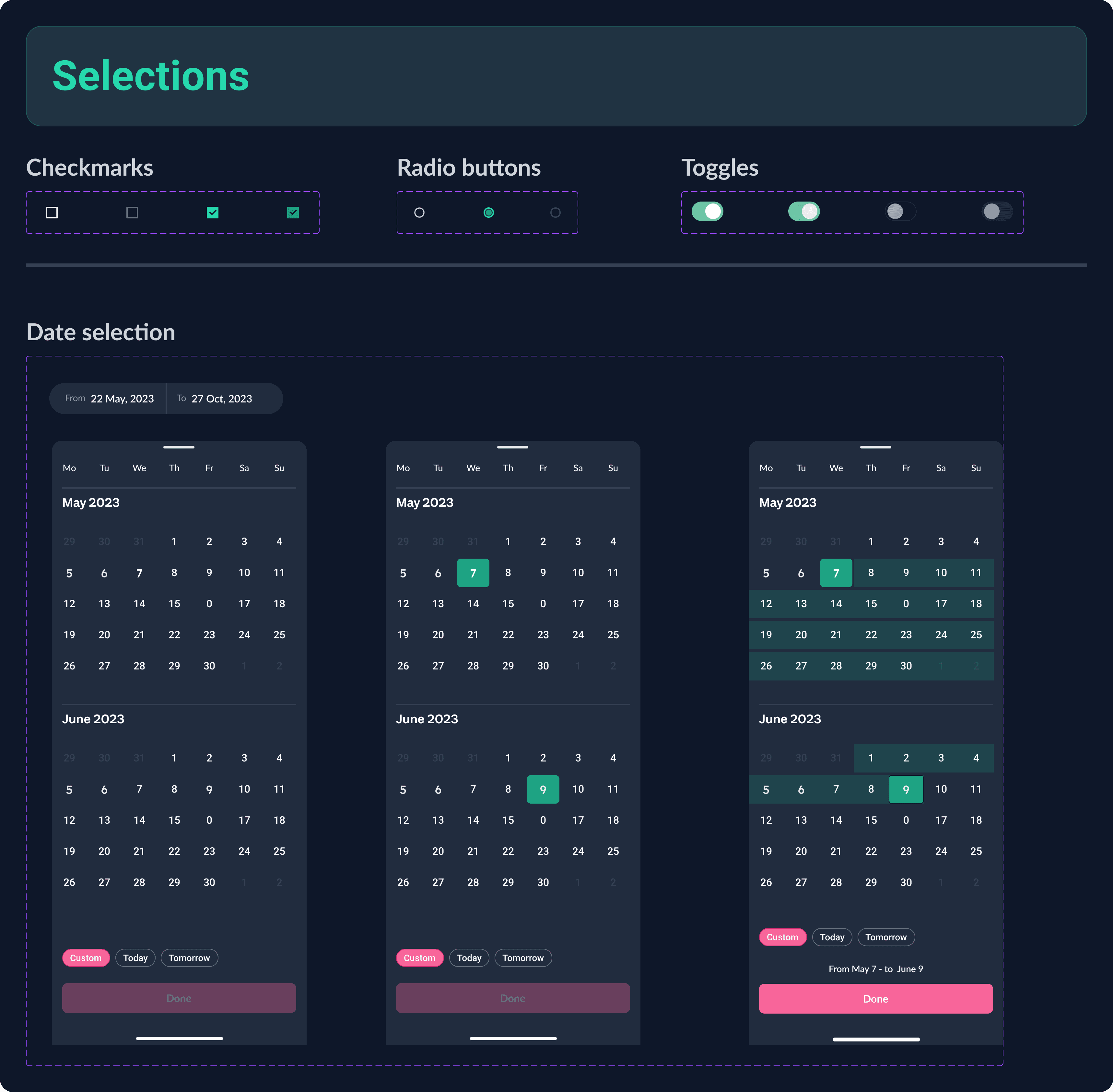
💠 UI kit
The mood board guided me in creating the UI kit and high-fidelity screens simultaneously. Many elements changed after running accessibility checks with WCAG.
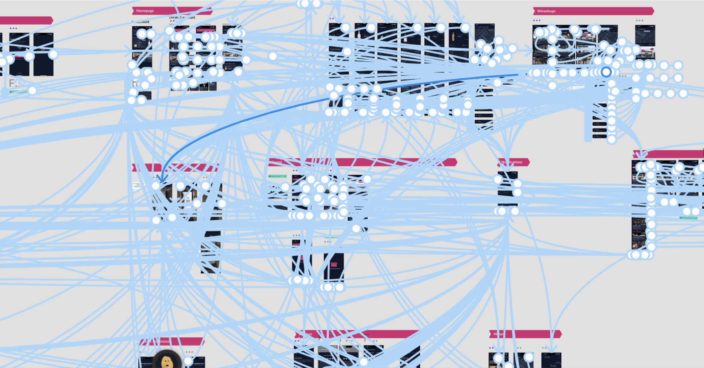
🧶 Prototyping or THE MESS
We picked Figma as our prototyping tool. Even though it might seem like a tangled spider's web, each path is carefully thought out and connected. I always screenshot this step and show it to my stakeholders. It makes me feel smarter than I am, kind of like I've cracked a secret code.
✨ Final Designs
The designs below are the final main screens I created and prototyped after three rounds of usability studies.
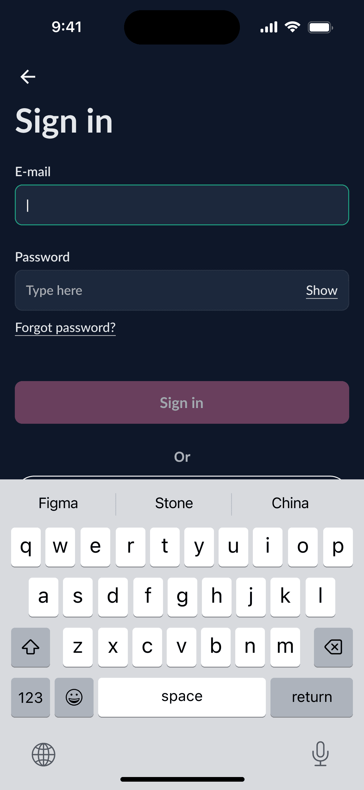
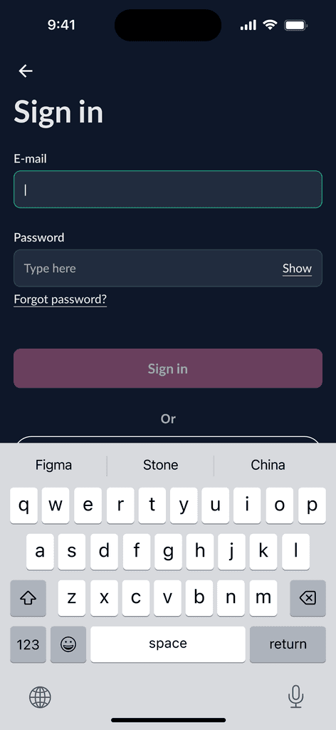
The sign in page.
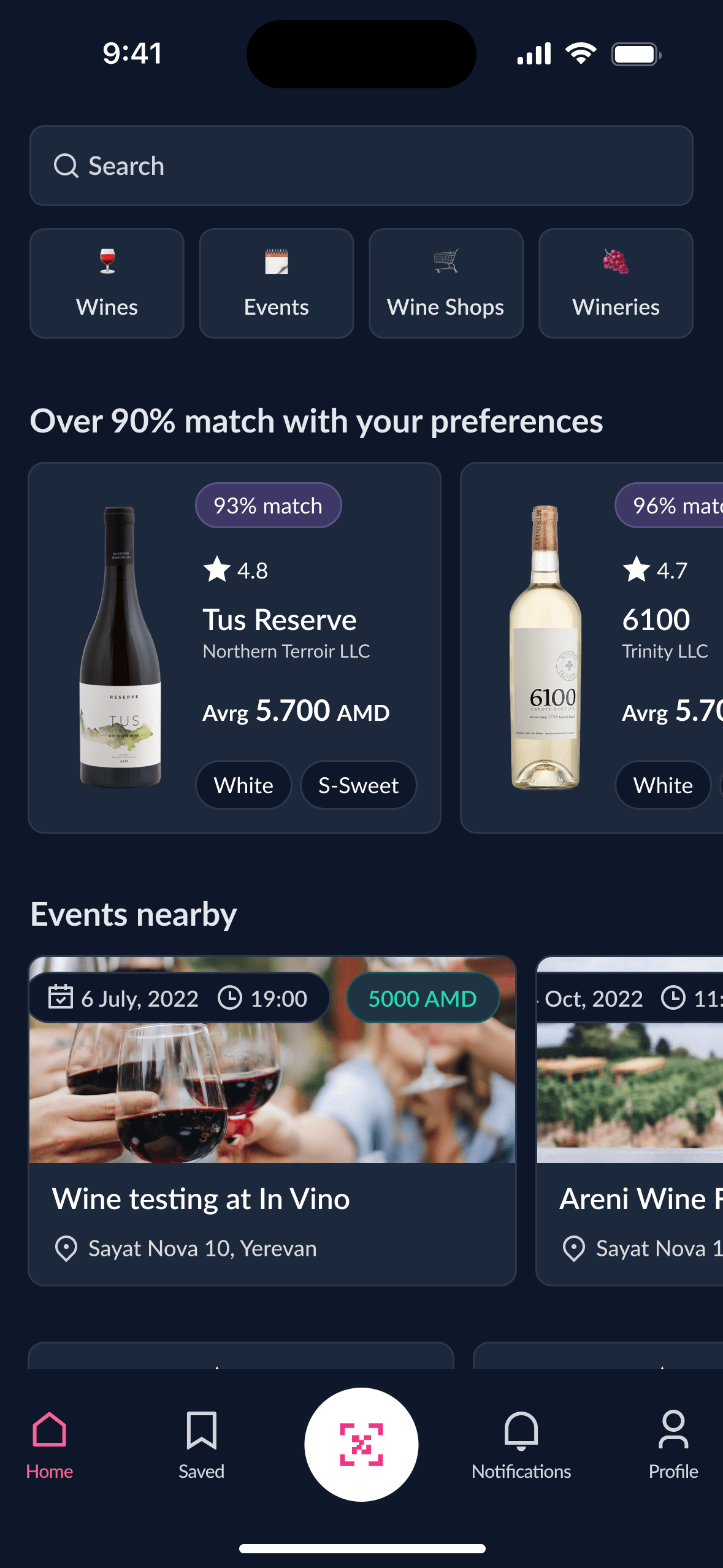
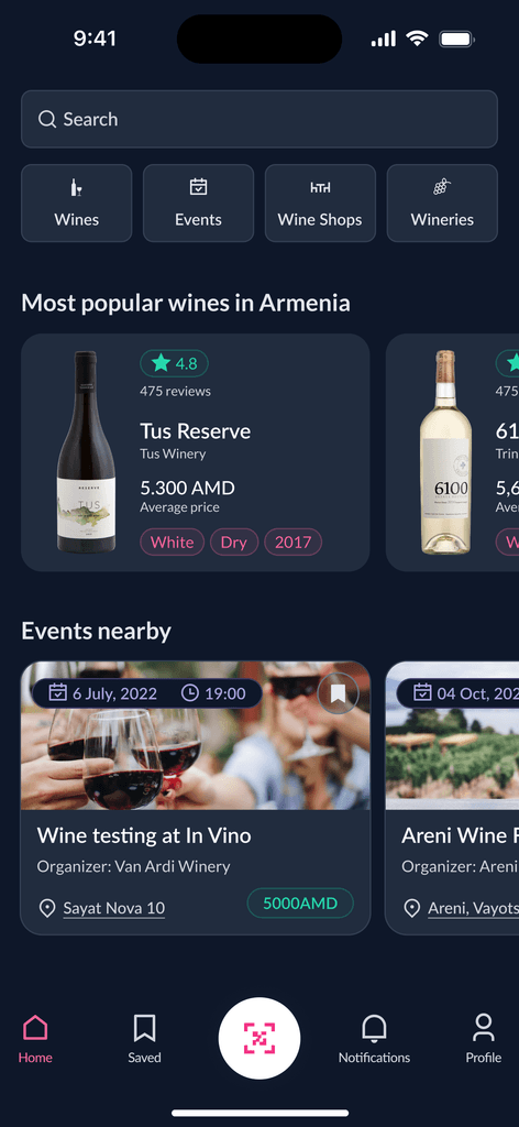
This is the homepage, featuring personalized recommendations based on user preferences and nearby events.
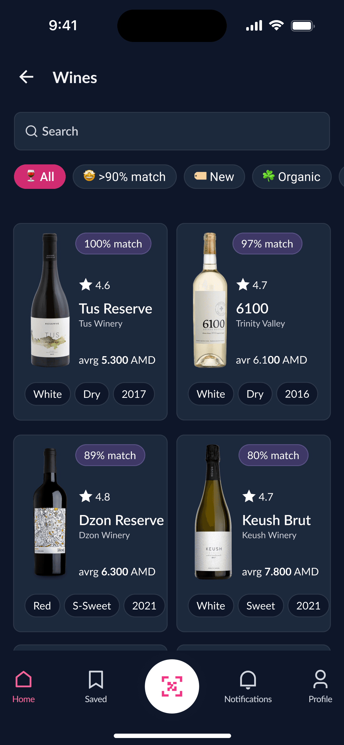
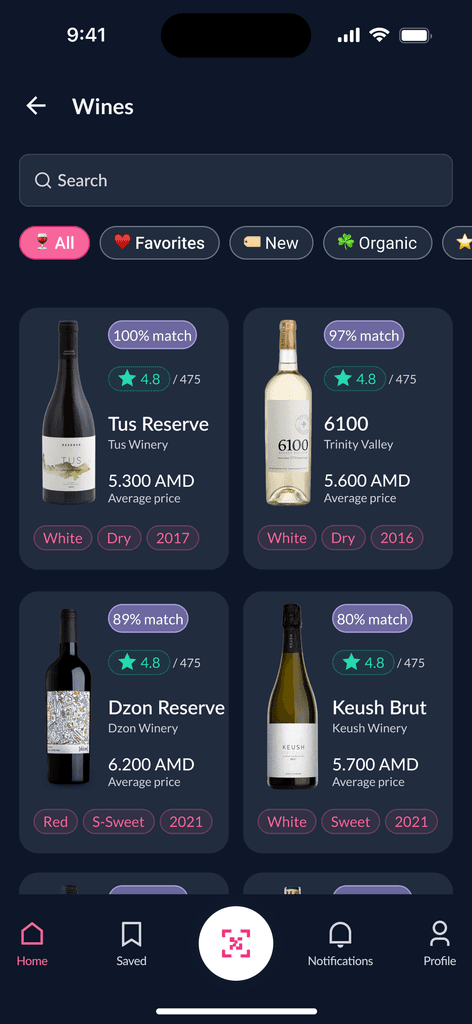
The Wines page offers various wine categories. Clicking on the cards opens detailed wine pages.
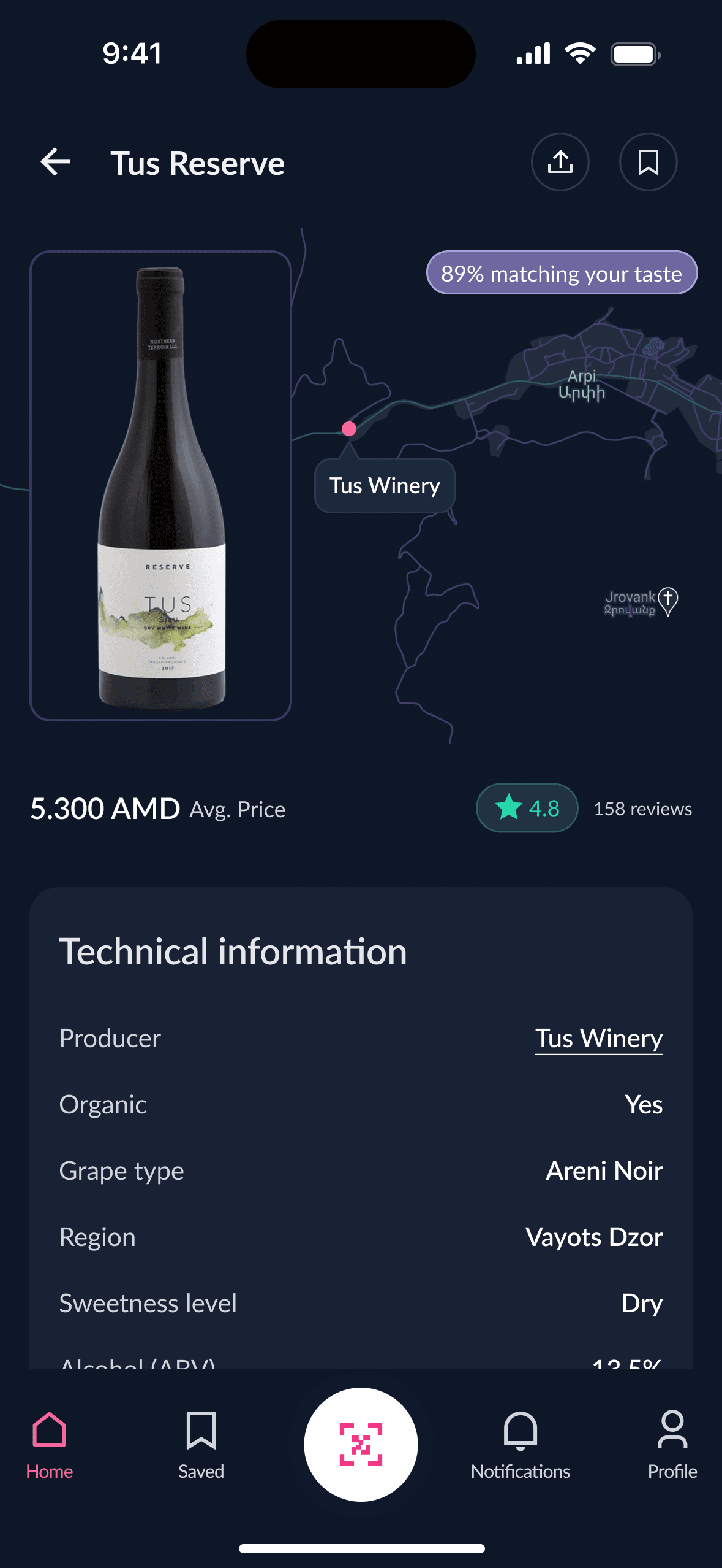
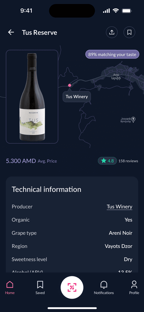
Wine detail page. Users with preferences set up see the matching rate.

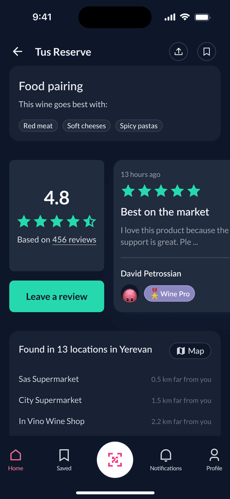
The Wine details page includes food pairing, reviews, wine availability, and more.

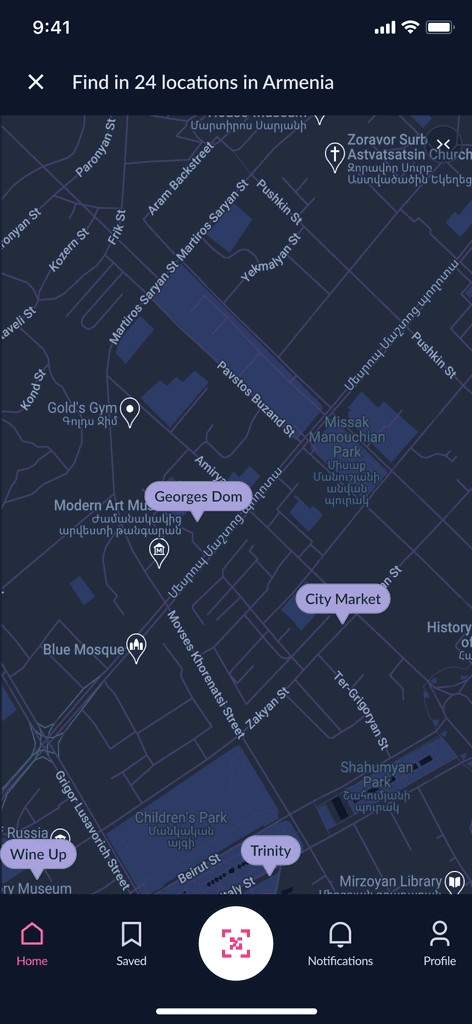
A map of wine shops offering the selected wine.
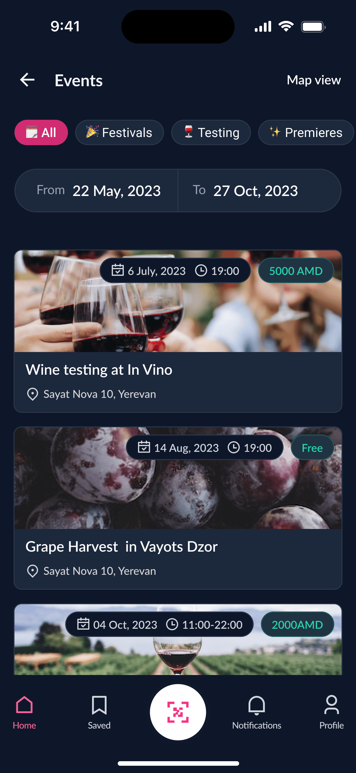
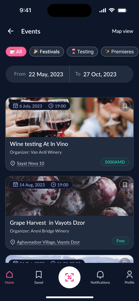
Events page with map and list view options for filtering events by categories and dates.
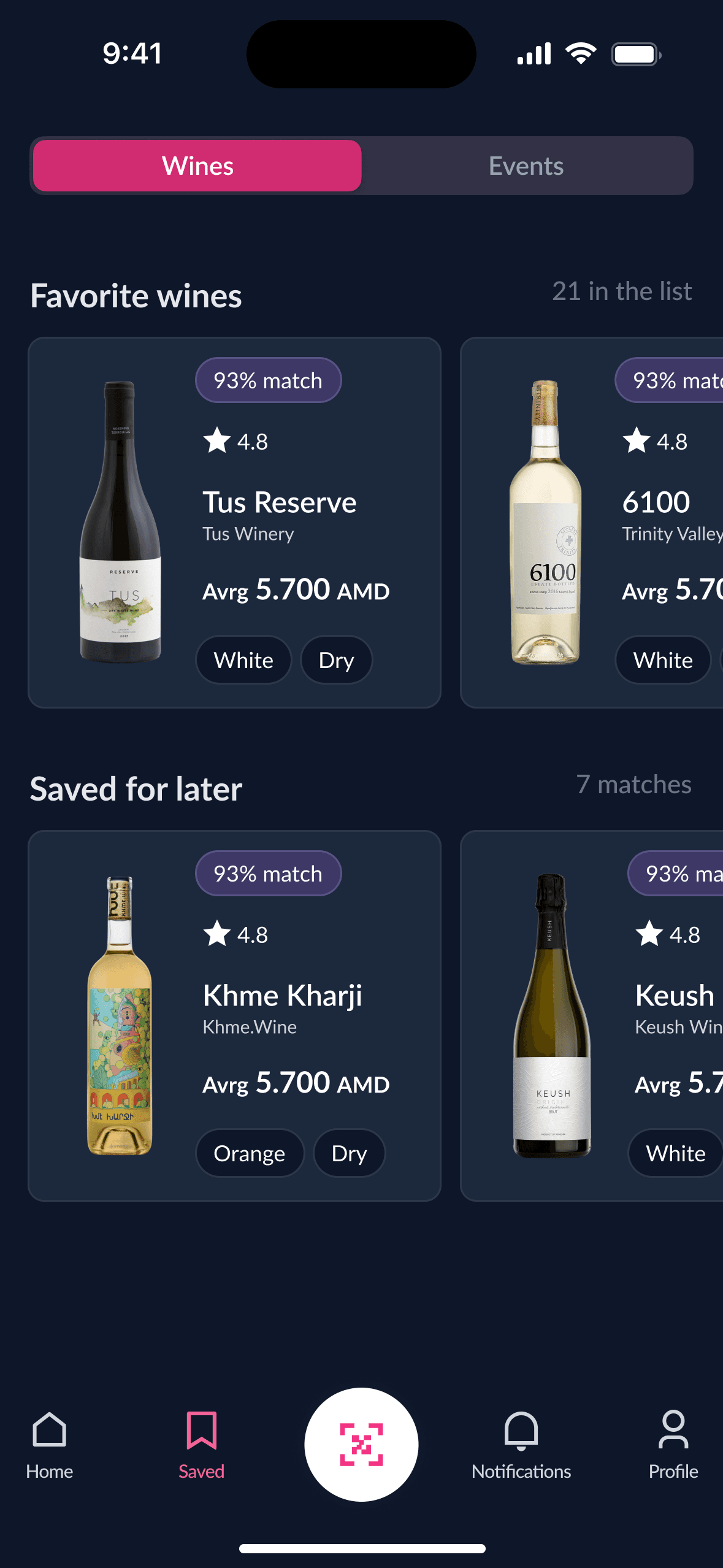
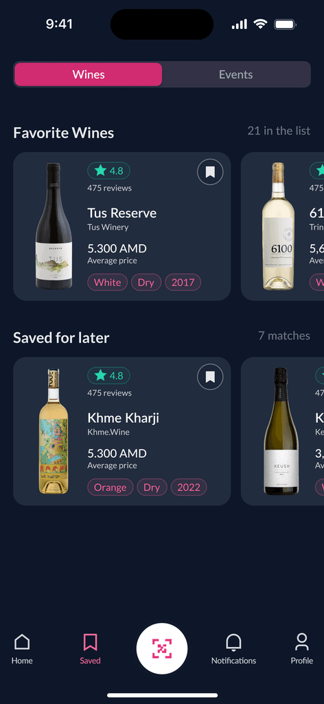
Users find saved events and wine on the "saved" page.
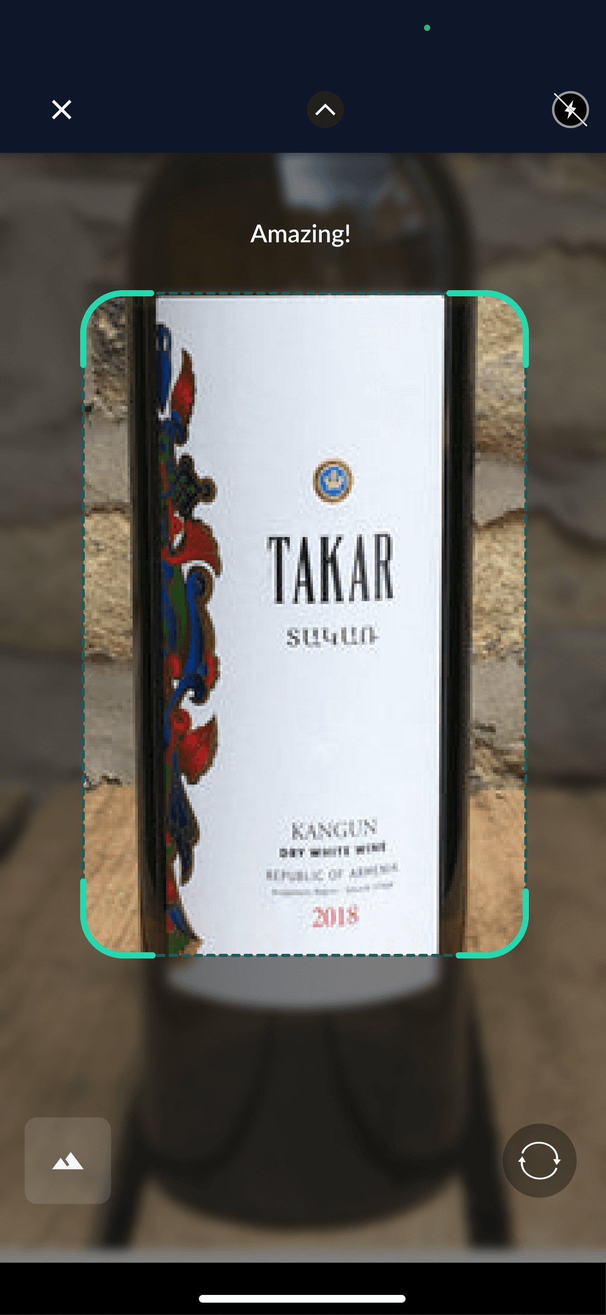
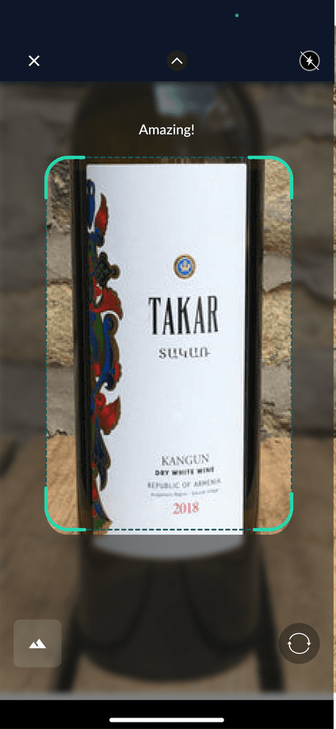
Users scan wine for info and ratings.
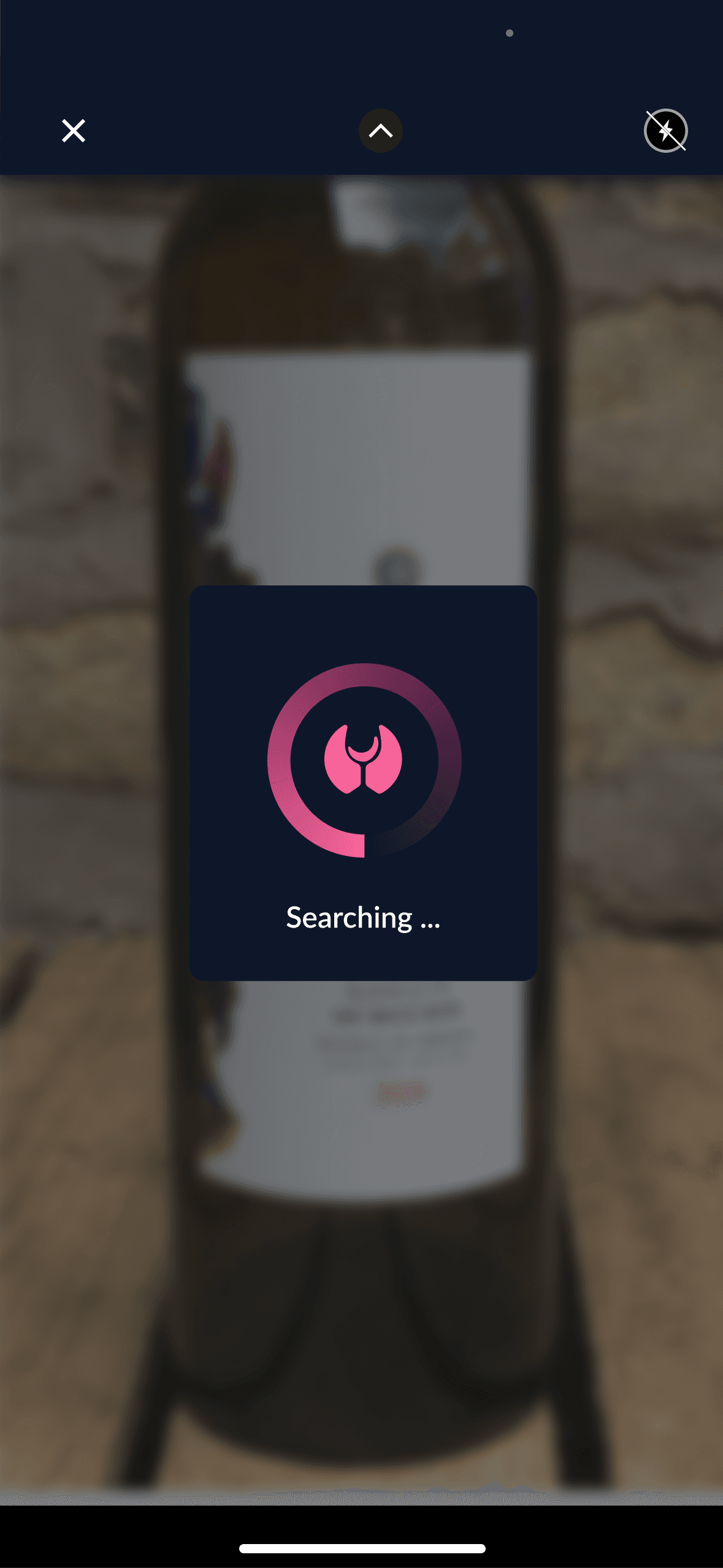
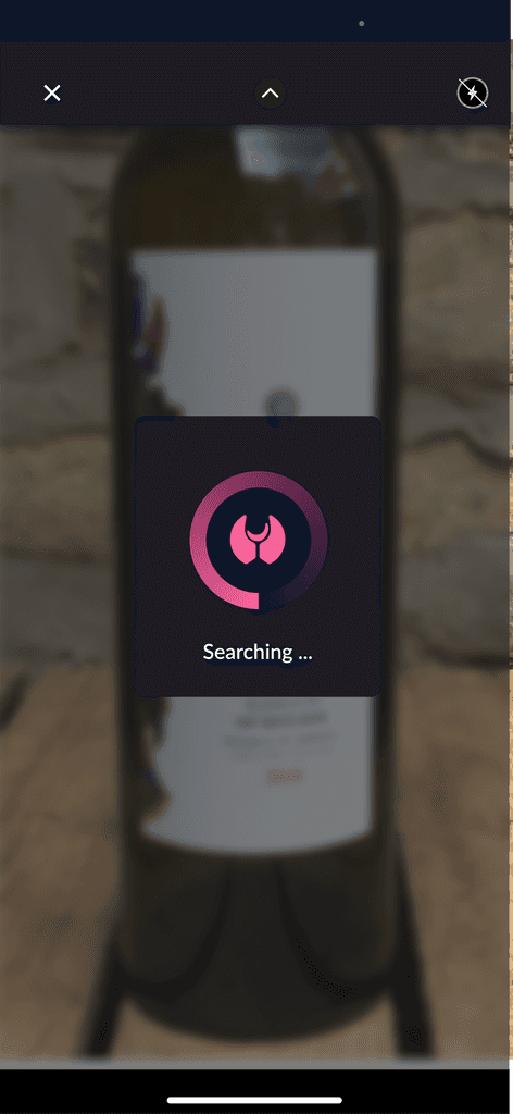
After scanning, a loading image appears while the app searches for the wine.
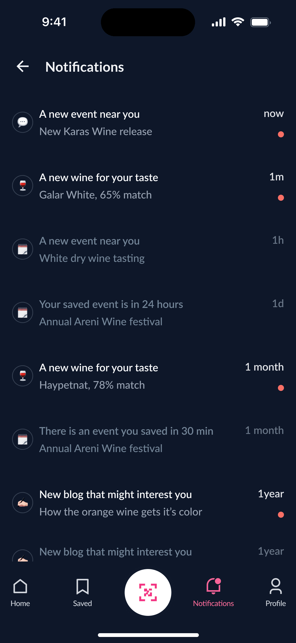
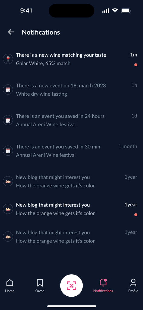
The notifications page updates patrons on occurrences, fresh vineyard unveilings, and pertinent information.
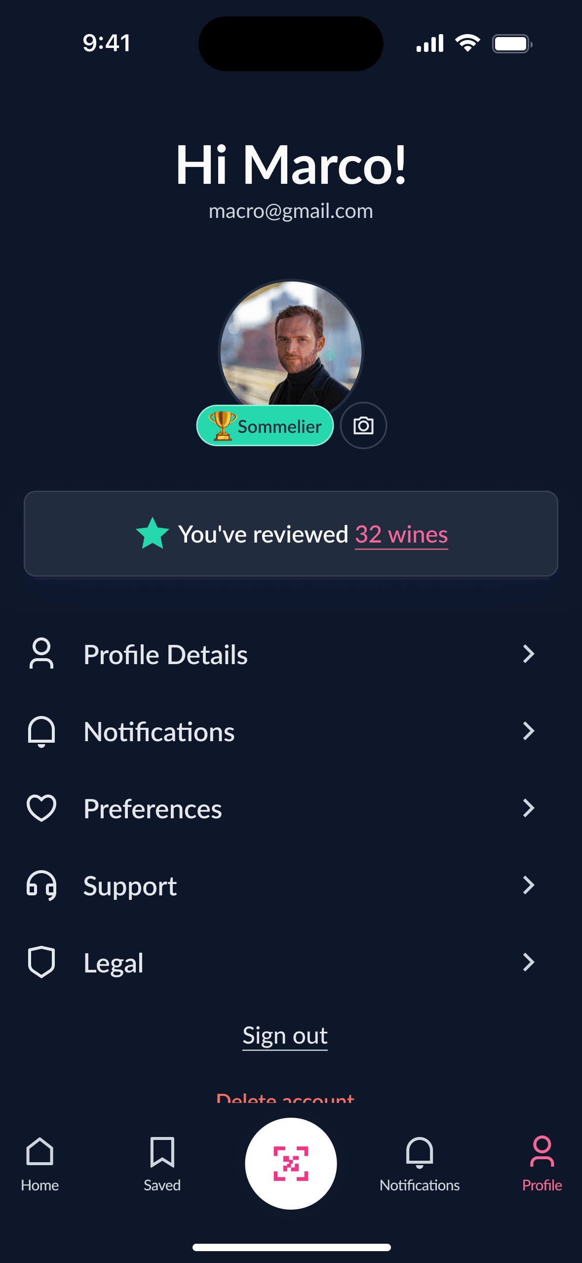
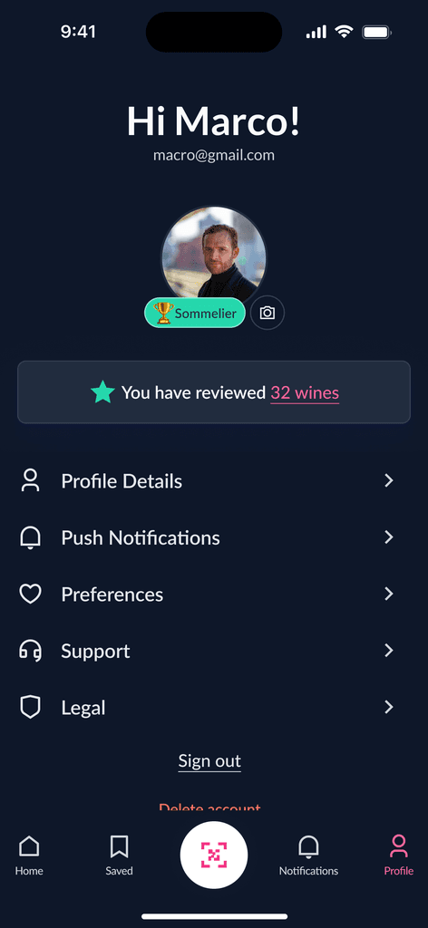
The profile page includes various categories and provides easy access to reviewed wines.
🚚 Handoff
I created a detailed handoff file, but when it comes to handoffs, there are always some cases not considered, which might be quite hard if not impossible to fully prevent. So, as part of my design creation process, I expect messages and calls from my developers, and I certainly receive them.
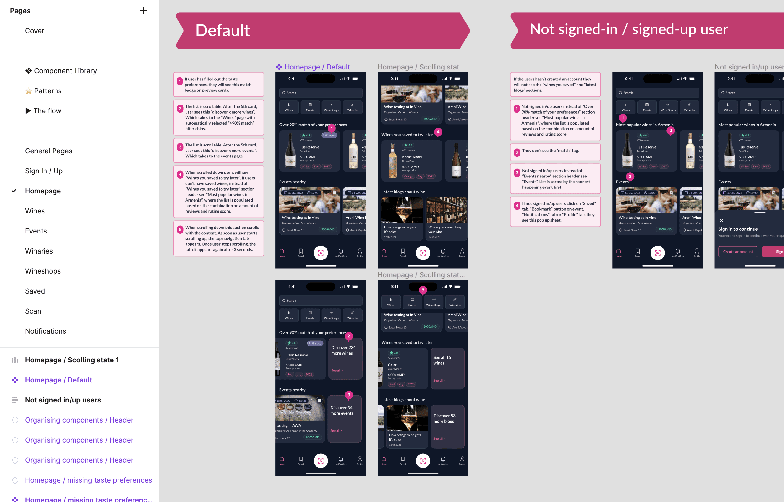
Screenshot from the handoff file with interaction guide.