Brickwise's Asset Selection Flow Redesign
Task Completion Time Decreased by 15%
Brickwise is an Austrian real estate investment app, that allows users to buy shares, co-own properties, earn rental income, and sell shares on the app.

❗Problem
In a recent research, we discovered that our users struggle during the initial asset screening process on the marketplace page, which prolongs decision-making, potentially resulting in business losses and missed opportunities.
😫 "I find myself flipping back and forth between different assets until I find one with a good rental income…".
👑 My Role
I contributed by conducting research, facilitating workshops, designing, prototyping, conducting usability studies, synthesizing findings, and handing off the updated designs.
You'll notice some language change from "I" to "we" in different steps, thats thanks to my teammates that supported me throughout the process.
🎯 Research Goals
To achieve our desired outcomes, we first needed to understand the problem. While we are guilty for skipping the research phase sometimes and rely on gut feelings, this project affected our key flow and value proposition. Based on our knowledge gaps and prior discussions, I created the research goals, which helped us choose research methods plan them properly:
User priorities and attitudes: Discover the most important factors for our users when selecting an asset to invest in.
Research Methods: Survey, User interview
Competitive positioning: Determine how the asset screening experience compares to competitors.
Research Methods: Competitive analysis
Pain points and decision-making barriers: Discover users' frustrations and the factors that contribute to prolonged asset selection.
Research Methods: User interview, Survey, Usability study
❓Survey
In collaboration with the marketing department, we sent surveys and received responses from 220 users who have invested in Brickwise assets. We wanted to know:
What factors do users consider most important when choosing a real estate asset?
Common obstacles and difficulties when searching for an asset.
Whether users are satisfied with Brickwise's offered investing solutions.

What factors do users consider important when choosing a real estate asset? translated from German.
💬 Think-Aloud Usability Study & Insights
I conducted 7 semi-structured online Talk-Aloud Usability Study.
🧐 From Findings to Insights
Honestly, defining insight is one of the toughest parts. Even though the outcome is based on data, your interpretation is what matters the most. So, I always have colleagues with me to look at things from different angles. With all of our efforts, we turned findings and knowledge into insights.


🎨 Storyboarding pain points
Using the storyboard technique, I drew out the users' struggles. Here is one of the 6 storyboards I created to illustrate various pain points we discovered.

🚦 User flow
We consolidated all the 'green-lighted' or, in our case, 'yellow-starred' task flows into one smooth user flow. Even though it looks simple, it was going to take loads of development and design effort, especially with some branding tweaks happening at the same time at Brickwise.
Doing everything at once might have left users scratching their heads, thinking they mixed up the apps. So, we split it into different releases. For example, the "asset selection flow" was divided into two separate releases.

✍🏻 Crazy 8s
I organized Crazy 8 sketching workshops online, except we took more than 8 minutes, and it wasn’t crazy at all. For the two releases, we did three rounds of "Crazy 8s" workshop:
For asset preview cards
For filter, sort by, and categorizing
For the marketplace map
Here are some of the designs we selected for refinement and discussion using dot voting.


✨ Iterative usability study
Here are our homepage design updates from the iterative usability studies.
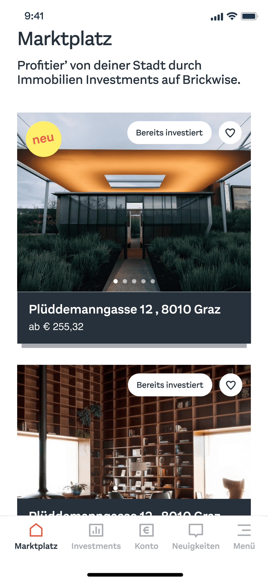
Old design.

Design to test for Release 1.

Final version for Release 1 after two rounds of testing

Design to test for Release 2
Final version for Release 2 after two rounds of testing.
✨ Final screens post 2 releases
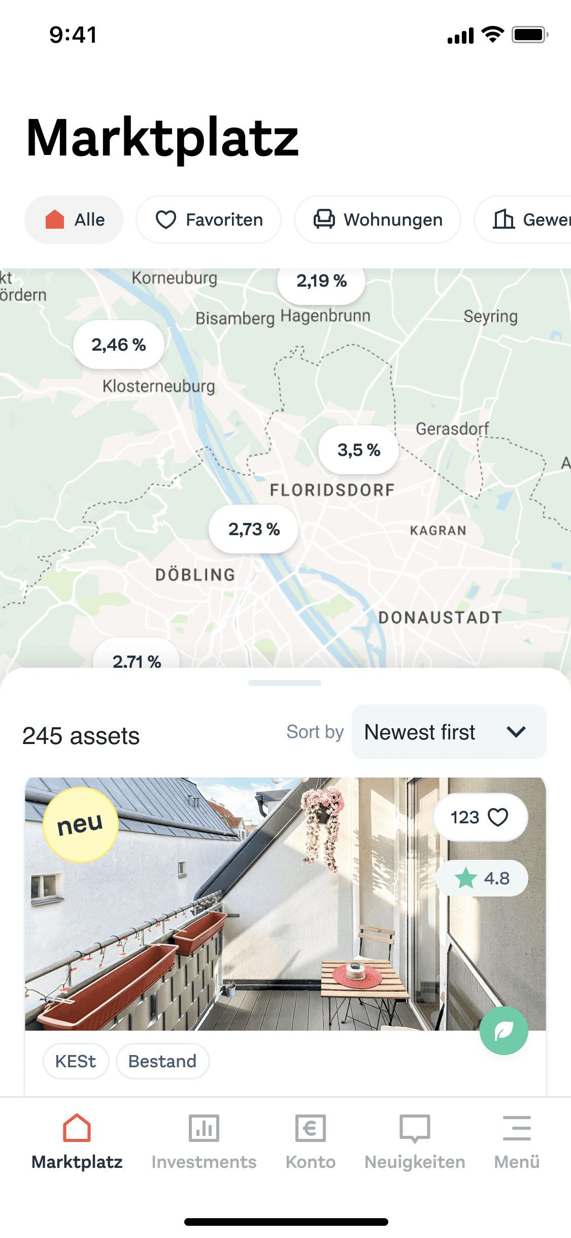
Thanks to our Bricks Design System, creating each screen was quick, though refining the designs took several rounds of feedback and iterations. Here is the marketplace page with its different states:

The default state, where we display the filters, map pins, and the list modal.

When scrolling the list modal covers the map.
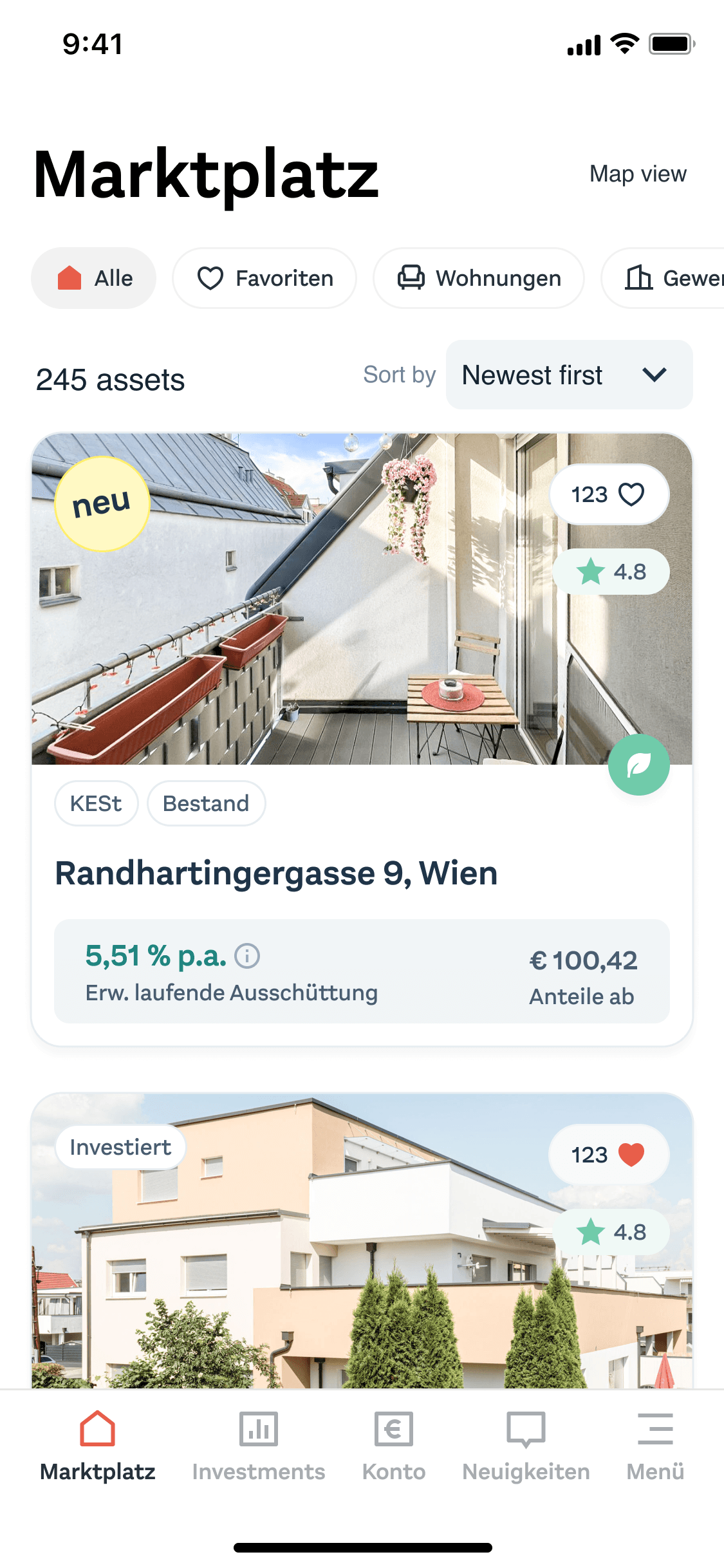
The list view.

The list view with sort by option expended.

The map view shows asset locations with rental income percentages.

When a map pin is selected, a small card pops up with key information to aid decision-making.
🫴 Handoff
When handing off, the screens grew to over 30, with all their states and cases. During development, I discovered more states not considered in the initial design.

Screenshot from the handoff file with notes.
💬 Feedback From My Supervisors

I highly recommend Tsov for her exceptional skills in user experience and design in general. I had the pleasure of collaborating with her on a mobile and web app for a FinTech product, and her expertise in Figma was truly impressive. Tsov's attention to detail, creativity, and ability to transform ideas into visually stunning designs made a significant impact on the project's success. She consistently demonstrated professionalism, responsiveness, and a strong work ethic. It was a pleasure working with Tsov, and I have no doubt that she would be a valuable asset to any team or organization.

Ms Hakobyan has extremely comprehensive and versatile specialist knowledge, which she always brought to our company in a profitable manner. Her extraordinary creative as well as organizational competence should be emphasized, which enabled her to put new ideas into practice at any time, to plan projects well as to execute them in order to meet the agreed targets in every respect and in the best possible way. Due to her very good comprehension skills, she was always able to quickly grasp even the most difficult situations and to find appropriate solutions. She also impressed at all times with her above-average enthusiasm.
Ms Hakobyan's performance exceeded our expectations at all times and in every respect. She was appreciated at all times because of her always open, friendly and balanced nature.
Her performance always met our expectations in every respect and in the very best way.