Using AI to design and Build a Garden Calendar Tool
Experimenting with AI to speed up the design and launch of a Garden Maintenance Calendar MVP for internal use at a landscape management company in the Pacific Northwest.

Tools I used
Since I didn’t have much time, I used AI tools to move faster and learn along the way. I kept manual design work low and relied on generated UI, code, and evaluation.


❗Problem
At my client, landscape and garden managers manage client info, plant care, and seasonal tasks without a shared schedule. They rely on memory, copy-pasting, and frequent site visits. Tasks are assigned through messages, calls, spreadsheets, or in person, which wastes time and leads to mistakes.
👑 My Role
My role was to understand needs, come up with ideas, build the MVP, test and improve it, and share the results with stakeholders.
🎯 Goal
A garden calendar could save time, help plan staff better, keep seasonal tasks on track, and prepare for busy seasons.
Build a working MVP to test whether it improves team productivity before investing in a full product.
💬 Internal User research
I talked with two user groups at the client’s company: managers who assign crews and tasks, and crew members who do the work. Here are the main problems and pain points that came up.
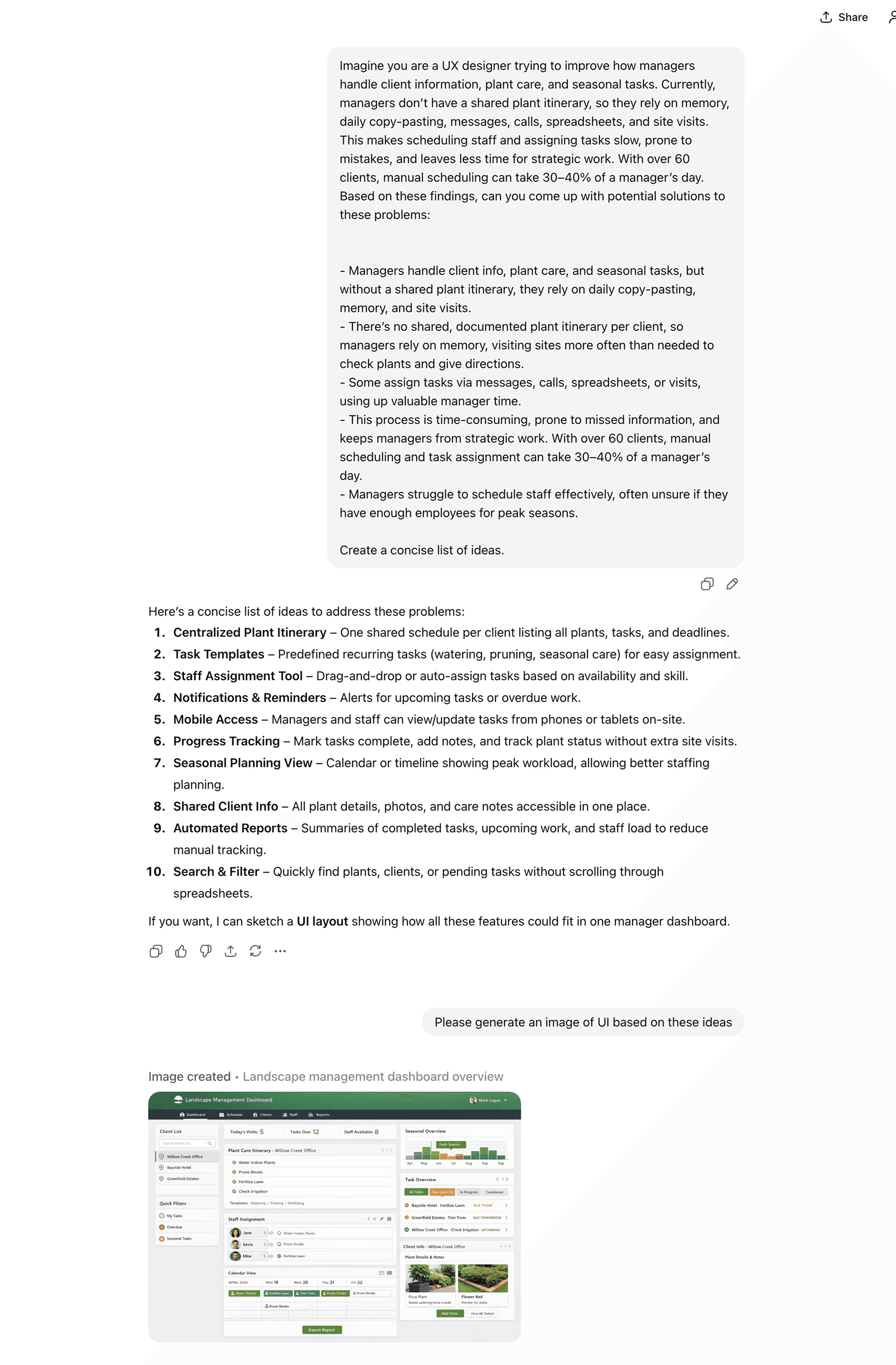
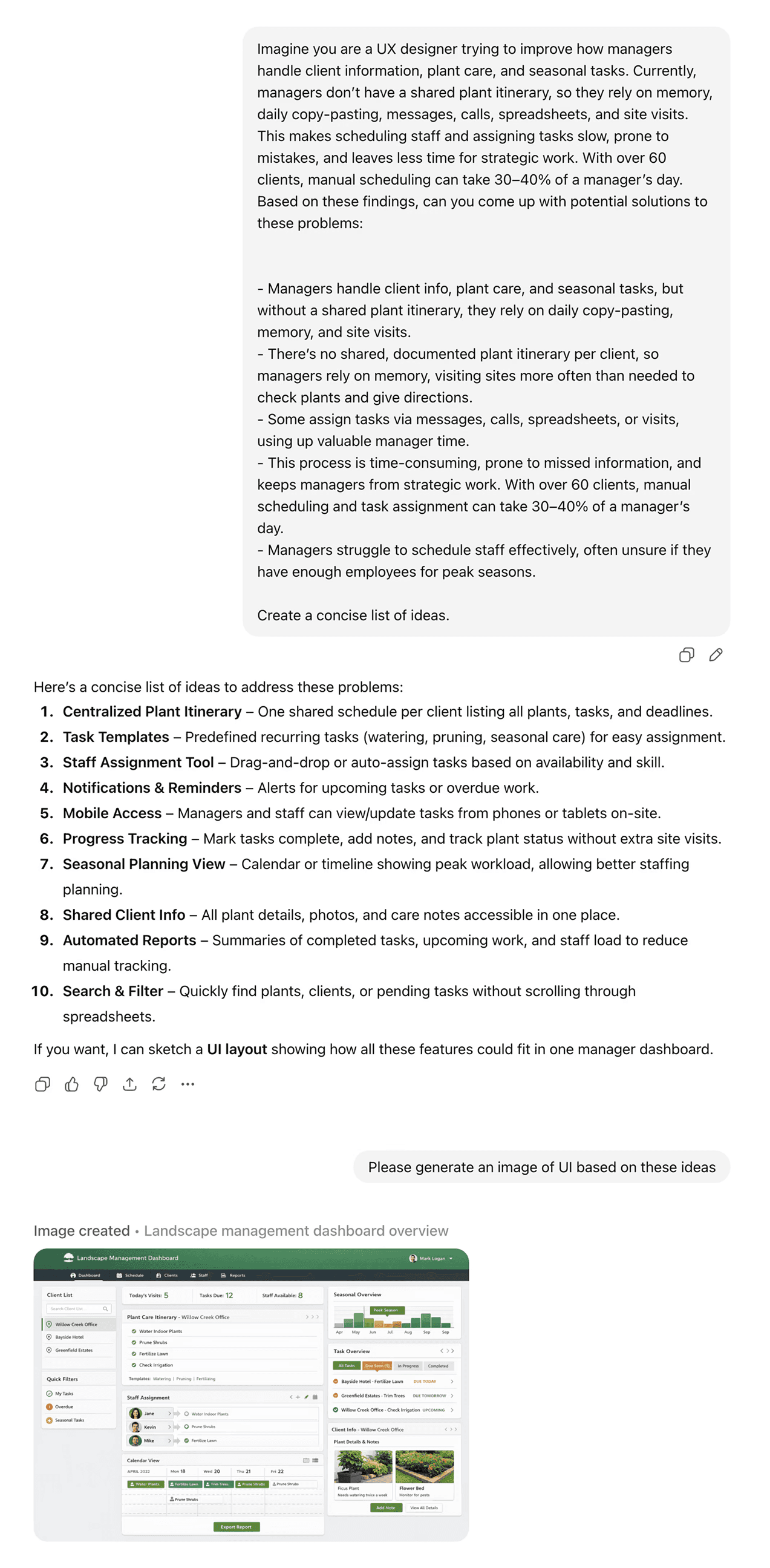
Managers handle client info, plant care, and seasonal tasks, but without a shared plant itinerary, they rely on daily copy-pasting, memory, and site visits.
There’s no shared, documented plant itinerary per client, so managers rely on memory, visiting sites more often than needed to check plants and give directions.
Some assign tasks via messages, calls, spreadsheets, or visits, using up valuable manager time.
This process is time-consuming, prone to missed information, and keeps managers from strategic work. With over 60 clients, manual scheduling and task assignment can take 30–40% of a manager’s day.
Managers struggle to schedule staff effectively, often unsure if they have enough employees for peak seasons.
🧠 Ideating with AI
I started by brainstorming with generative AI. I shared my findings and asked for ideas, then had it generate UI images based on those ideas. I tried this with Grok, Gemini, and ChatGPT.
✍🏻 Designing UI with AI tools
I used Figma AI, Nano Banana, ChatGPT, Grok, and Uizard to test ideas. Since free versions have daily limits, I switched tools or changed prompts when results weren’t good. Here’s how the designs evolved from early drafts to the final version.
💨 Testing different AI coding tools
I tested Replit, Bolt, and Lovable using their free versions. I started the app with AI-generated UI images and a PRD. I liked Lovable’s UI and the ability to tweak elements without using credits, but Replit was the better choice for now since it handles most of the backend without deep knowledge.
Here’s how each tool handled the designs differently.
🔄 Concept testing
I went to my client’s office, showed the MVP, and tested it with the managers and crew members. Overall, I got very positive feedback, but here are some negative points that helped me improve it further.c
Plant care needs more flexibility. Right now, monthly tasks are auto-generated from preset plant care based on the season. This pushes the product toward a gardening calendar. The new direction shifts it into a garden management app by allowing managers to add custom tasks, like one-off client requests.
Managers liked seeing each client’s calendar and to-dos, but also want an “all clients” view to understand total workload for the season.
I noticed that a manager called after sending tasks to explain details (for example, how to trim bamboo). This shows task instructions need to be clearer in the app.
For crew members, mobile view matters most since they rarely, if so use computers.
Crew members want to quickly see what task needs to be done and on which plant without clicking around.
Crew members want something simpler than logging in, switching views, and selecting clients. They’re not very tech-savvy and asked if there’s a way to automate or simplify this flow."
🧼 Clean up
Then I used Baymard Institute’s UX-Ray AI tool to evaluate the app. UX-Ray scans all components and gives best-practice guidance based on 200,000+ hours of UX research. It flagged some issues, some I fixed, and some I skipped due to time limits and the MVP nature.
Some fixes were easier using prompts, while others I did directly in CSS. Lovable and Replit make it easy to adjust things like padding, margins, font sizes, and colors.
I also used accessibility tools like Wave to check basics and fix some background issues.
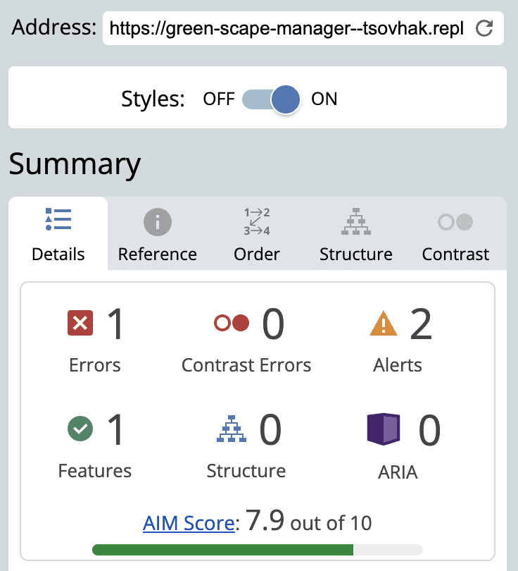
One of my favorite accessibility extensions is 'Let's Get Color Blind,' which shows how something would look to colorblind users. It made me realize how confusing these gain chart colors can be for people with the most common type of color blindness: deuteranomaly.

View as seen by users without color blindness.

View as seen by users with deuteranomaly (both purple and blue appear as blue.)
🎨 Final screens
With MVP projects like this, you have to accept some rough edges and ship even if it’s not perfect. Once it reached a “good enough” point, I published it, even though spacing, typography, and colors are inconsistent, but overall it works and looks better than I expected.
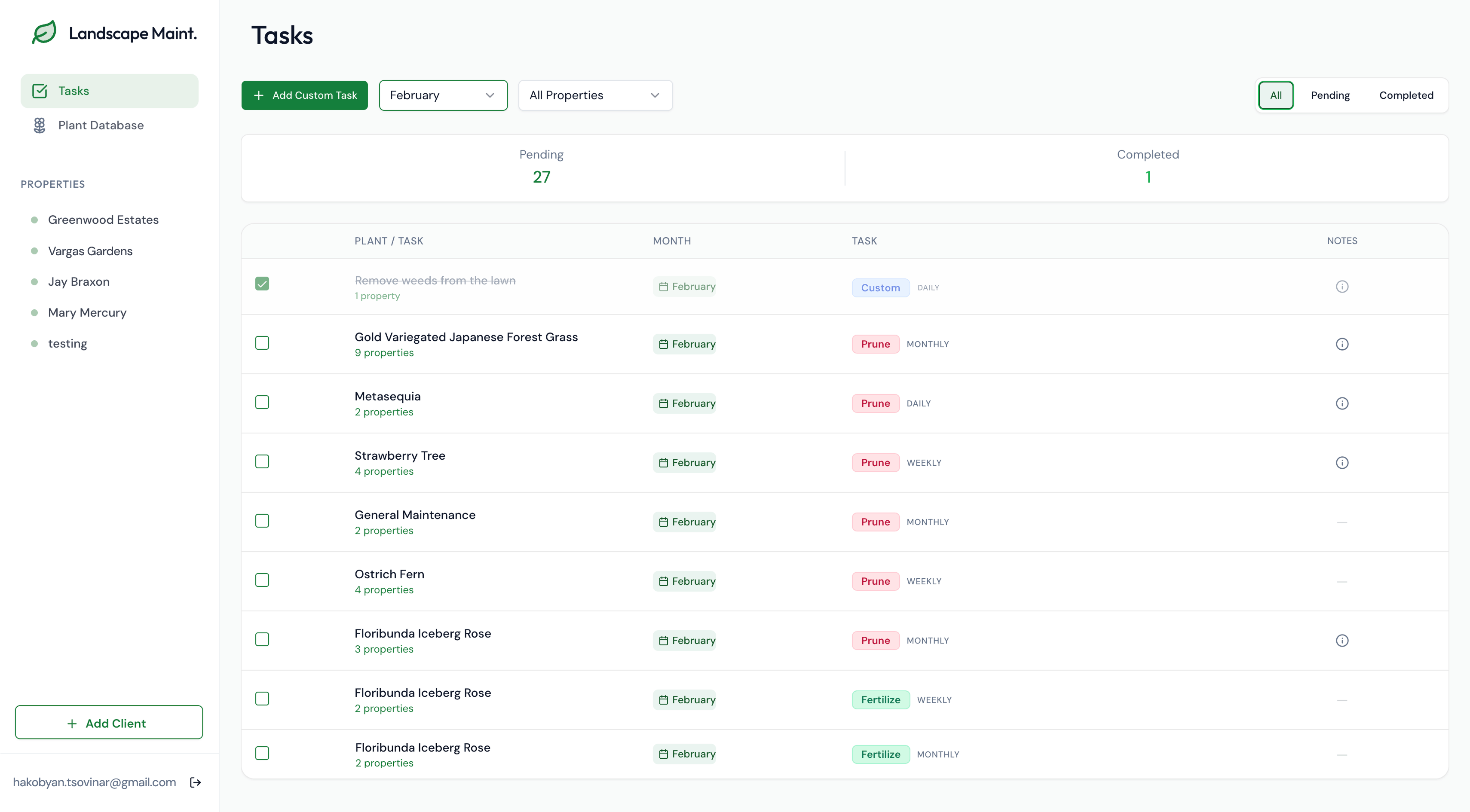
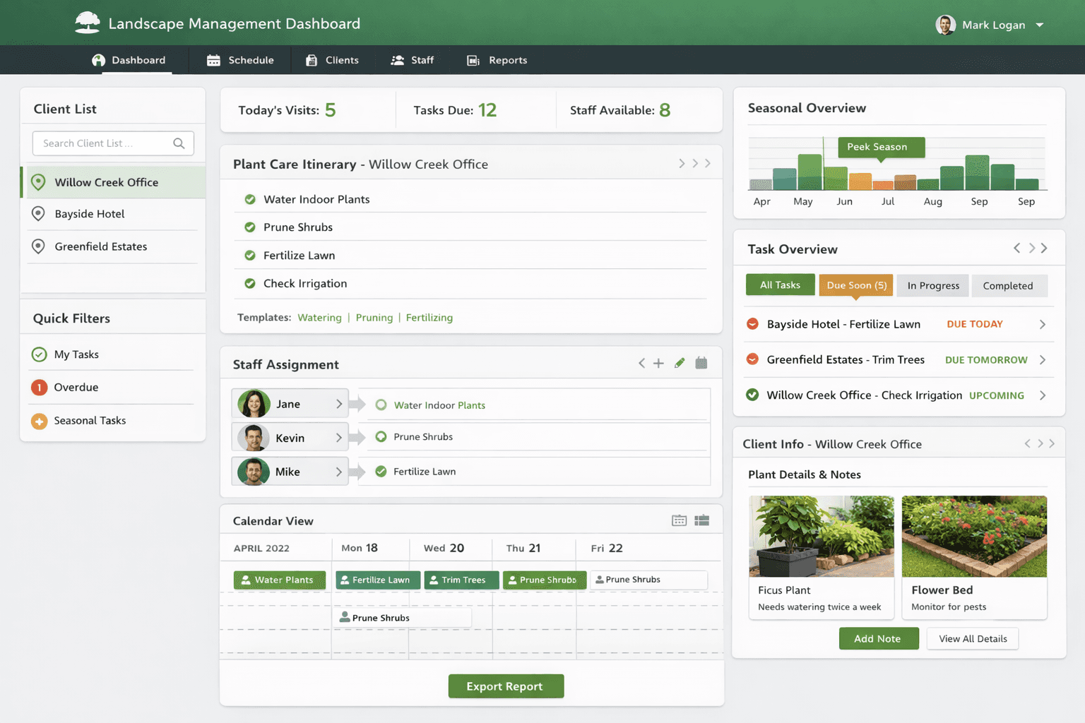
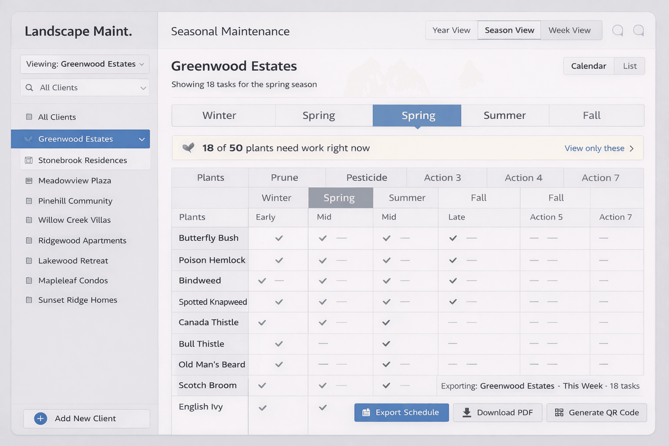
Tasks: High-level view of the monthly plant care list across all clients. This is the first page managers see when they log in.
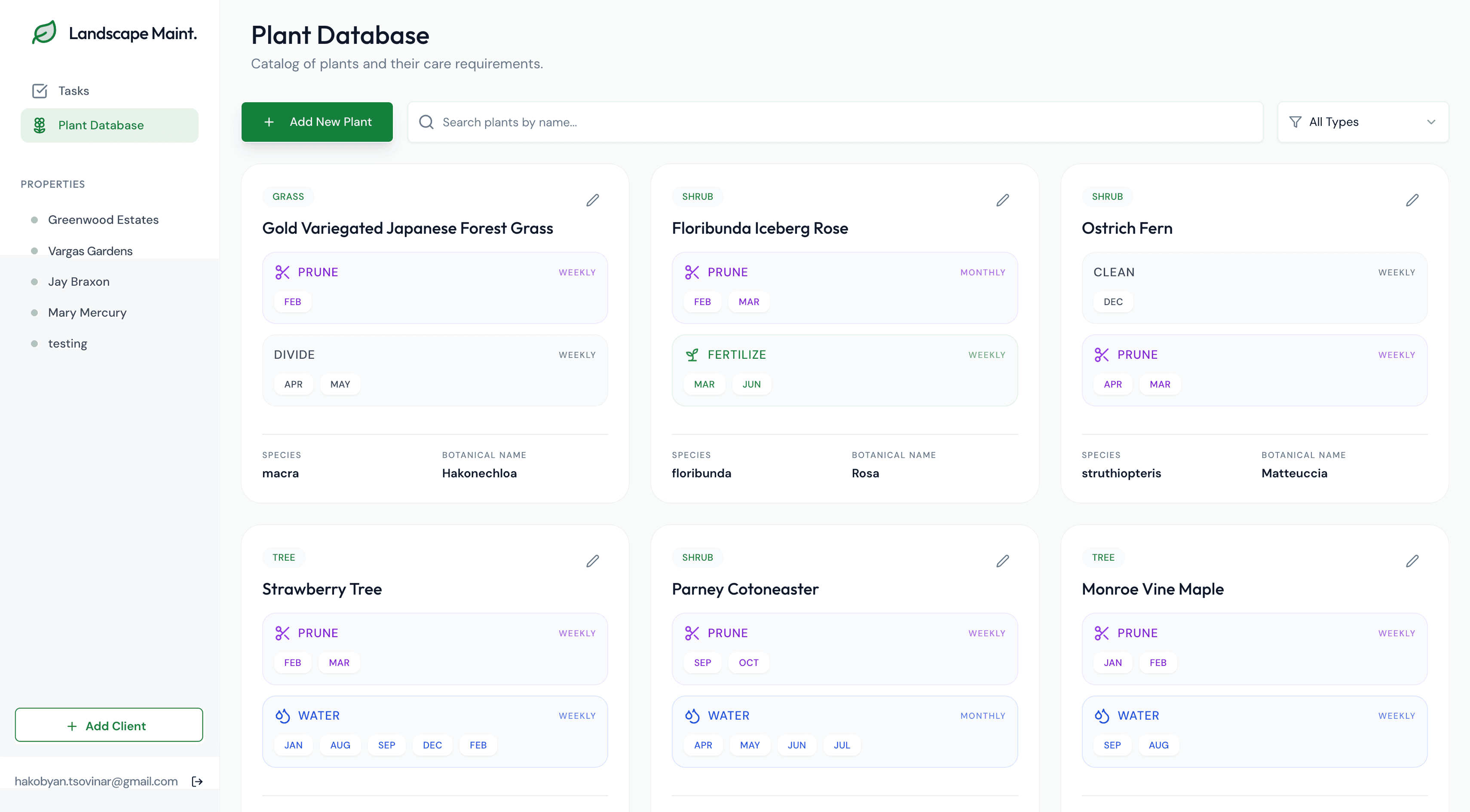
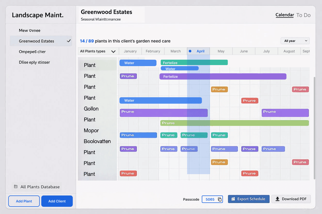
Plant Database: This shows all plants across all properties. You can add new plants or edit existing ones here. In the final version, we’ll add a list view, like a spreadsheet, which will make it easier to scan.
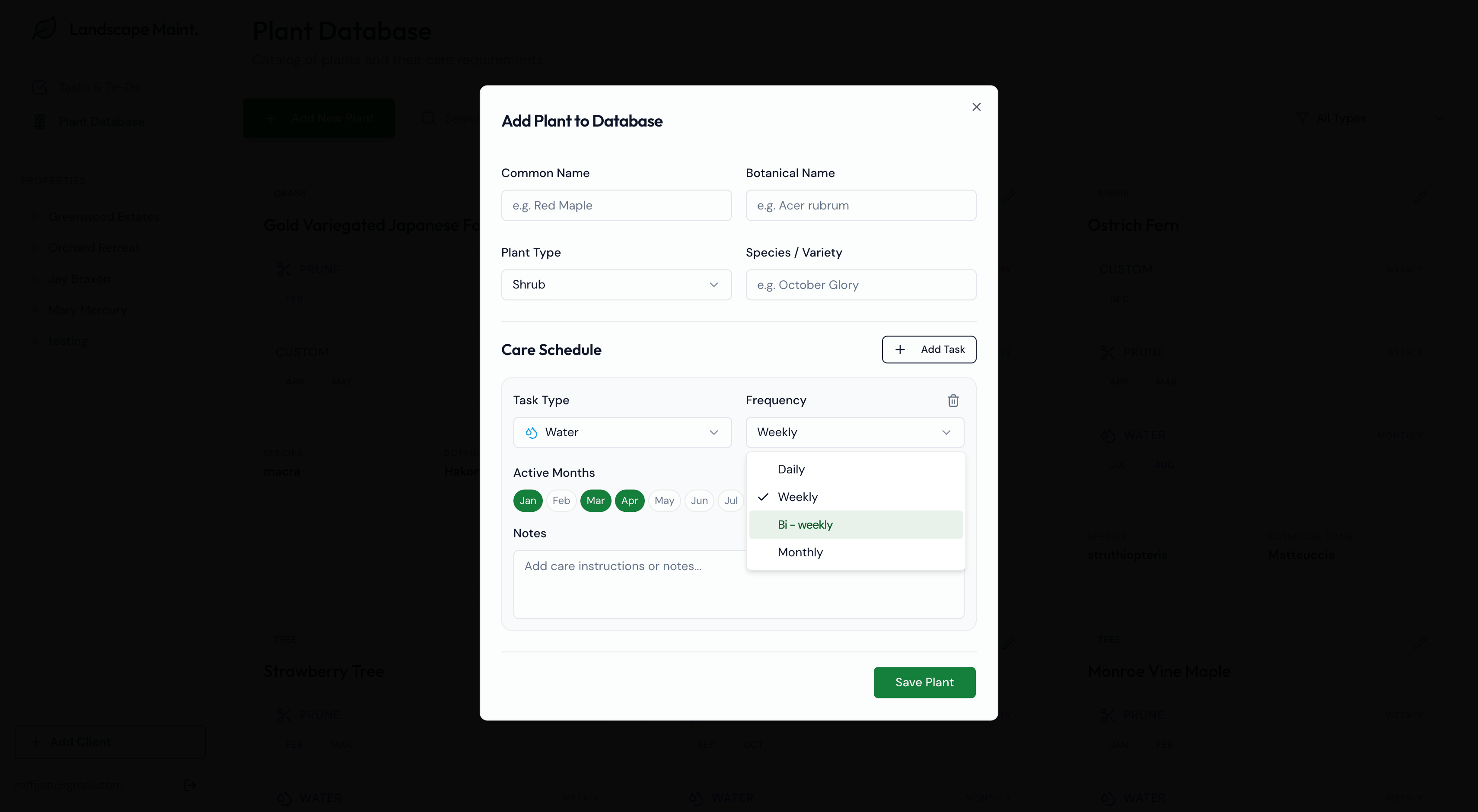
Add a New Plant: I’m happy with how this modal turned out, it got managers excited during testing. You can choose a task type from the dropdown, which also has a “custom” option if your task isn’t listed. You can add multiple care tasks for each plant, like watering, pruning, or fertilizing, and set which months each task should happen.
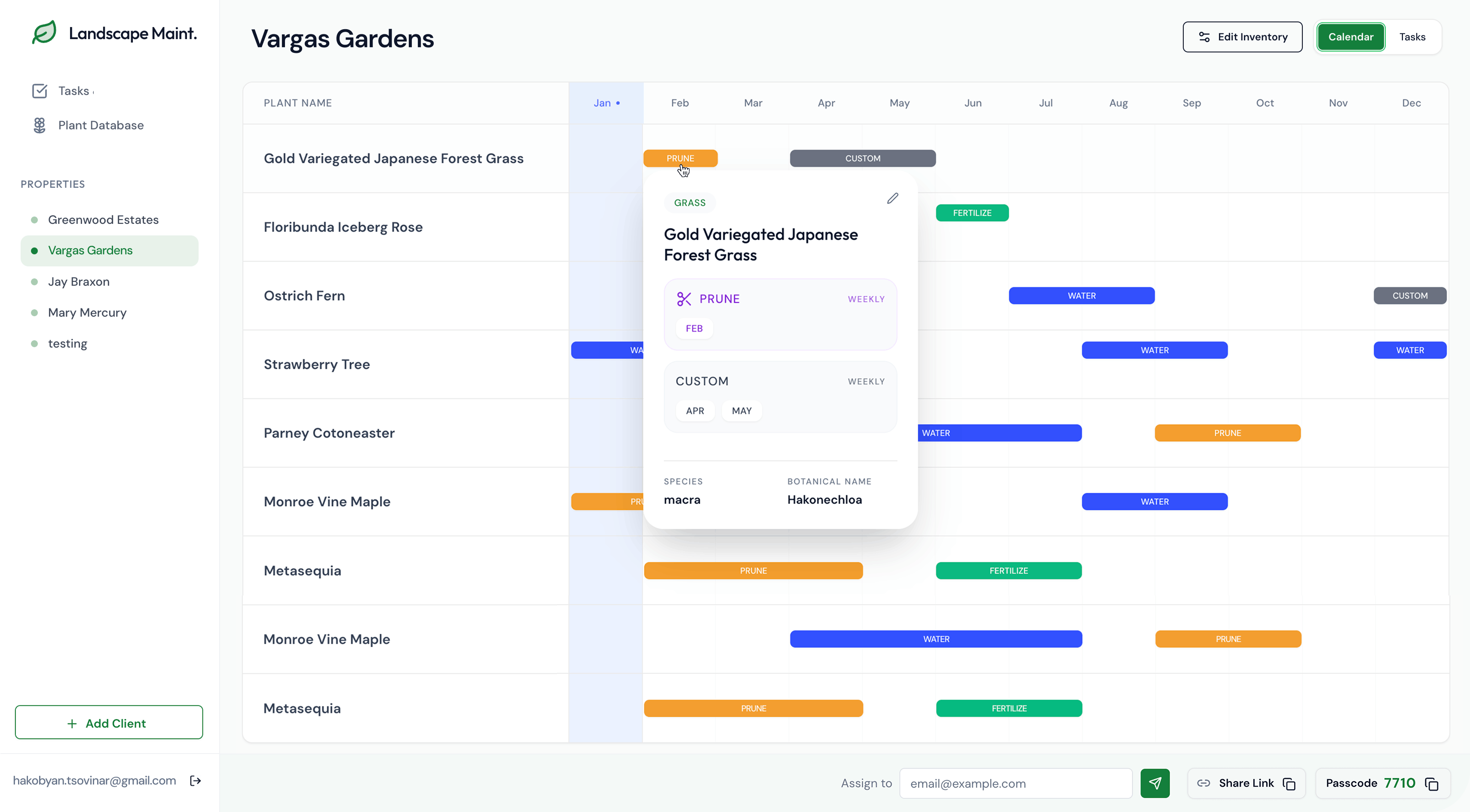
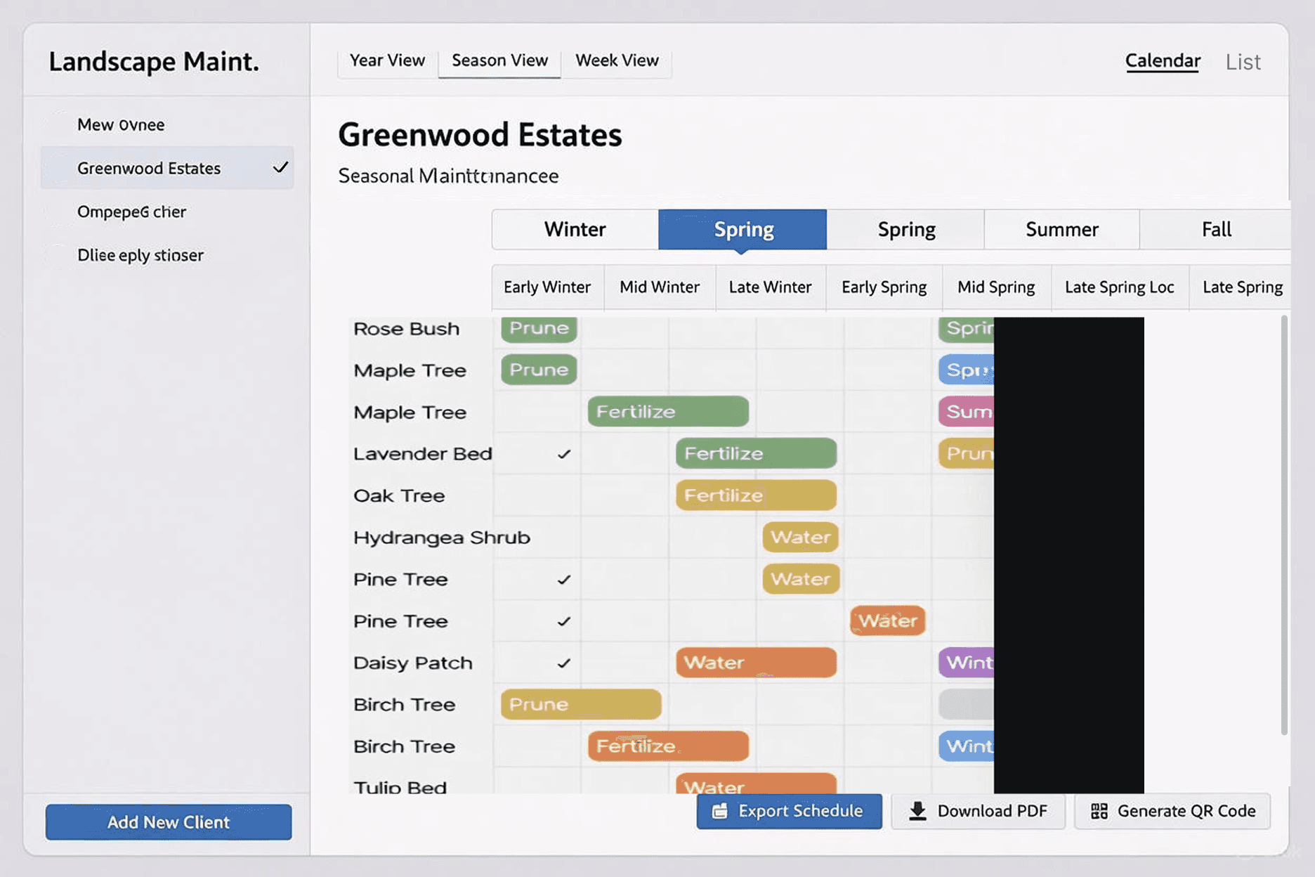
Garden Maintenance Calendar: You can click on care items to preview and update them. It shows which plants need care, when and how, and the task distribution and workload across seasons.
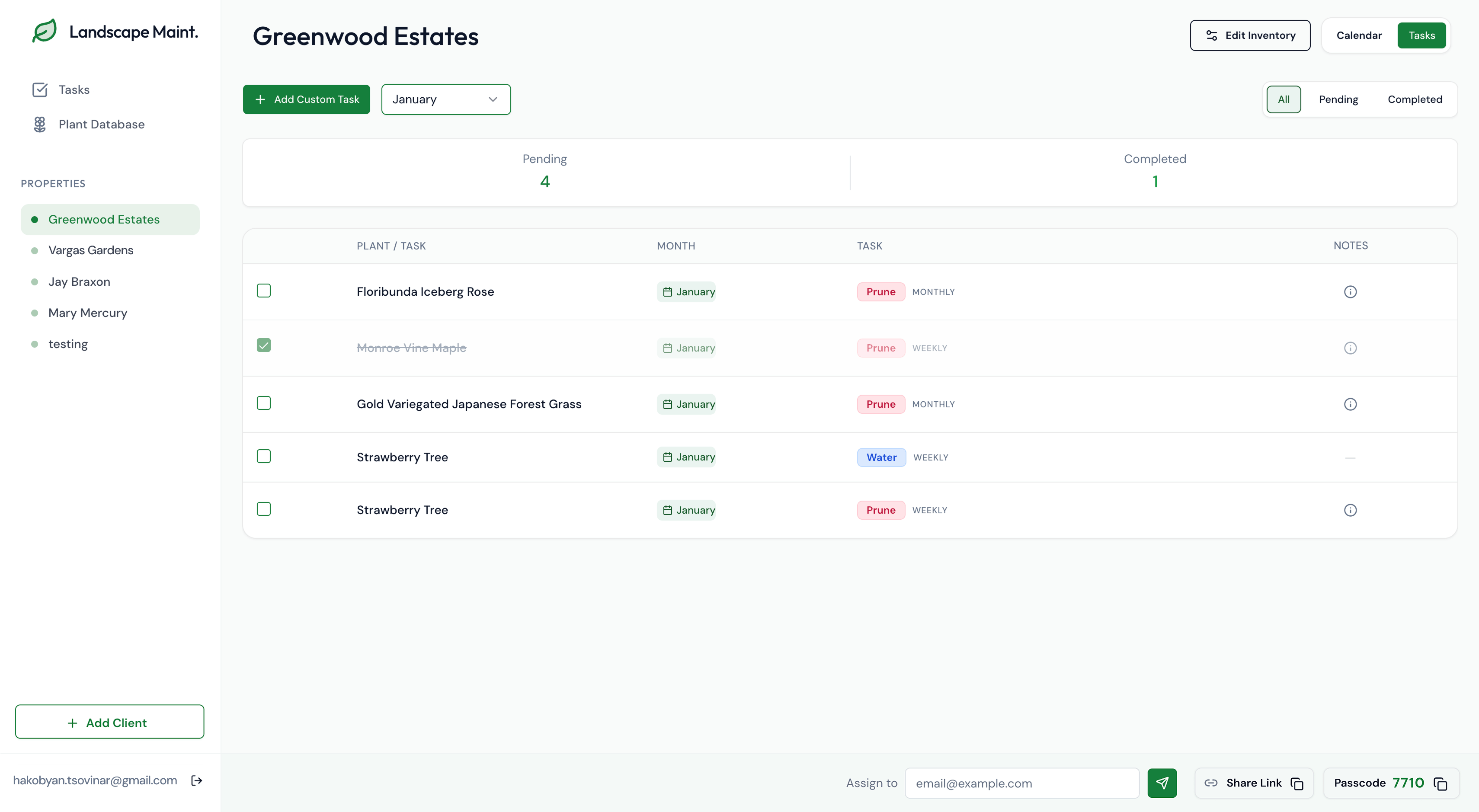
Task View: One important thing I wanted to test was how managers communicate tasks with the crew. To keep it simple, each property automatically generates a passcode. Managers can share the link or email the page along with the passcode, so crew members don’t have to log into a complicated app.
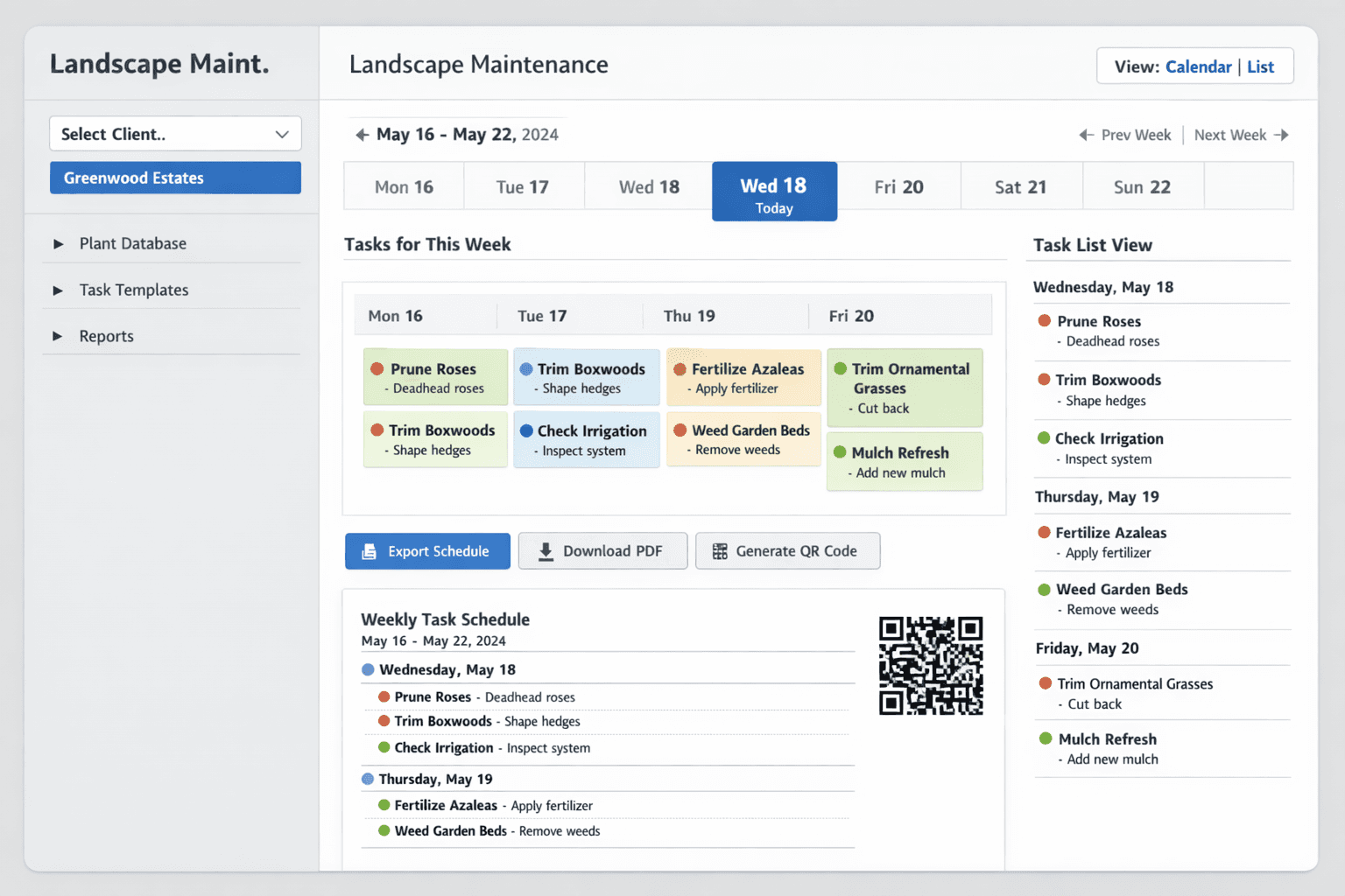
Mobile View for Crew
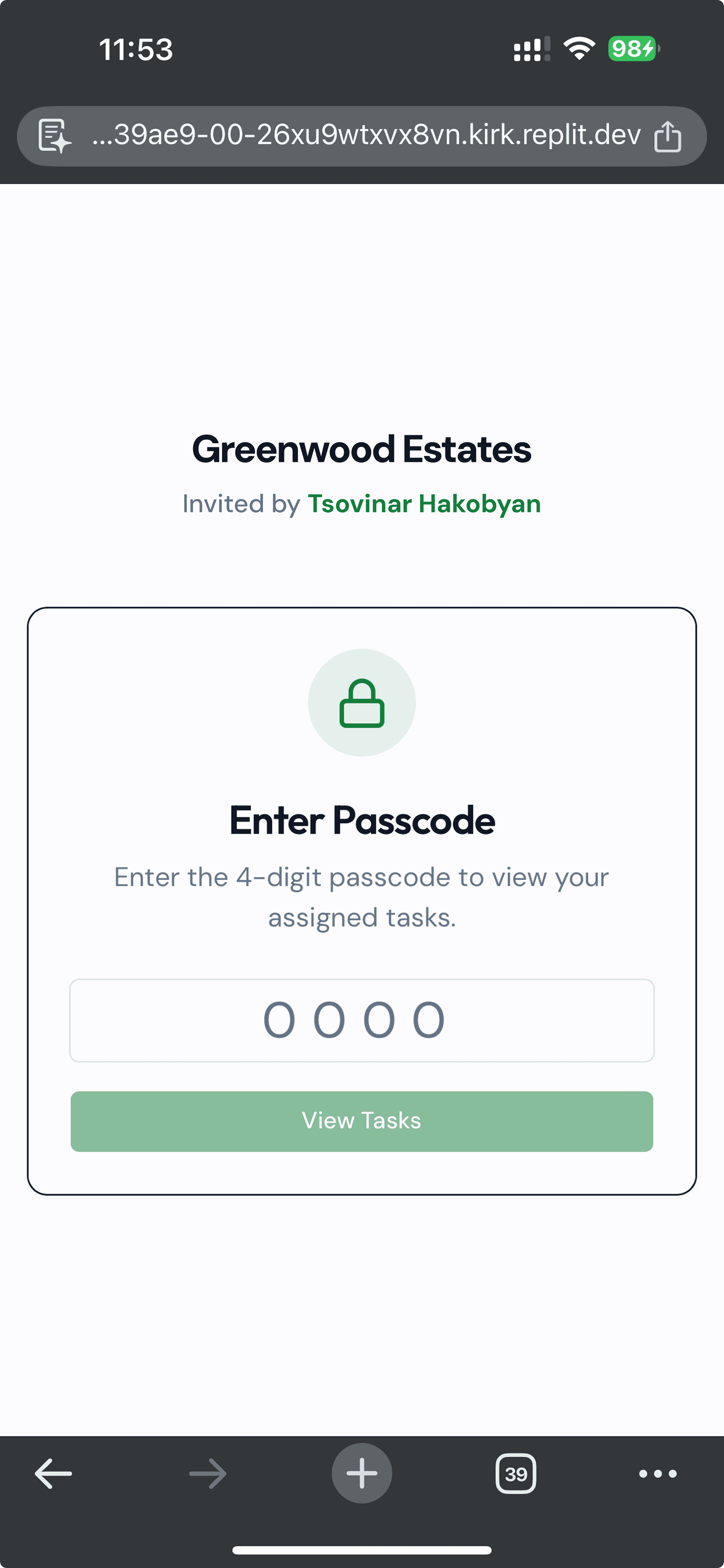
Crew members get a link by email or copy it from somewhere. They enter the 4-digit code to access the page and see their tasks.
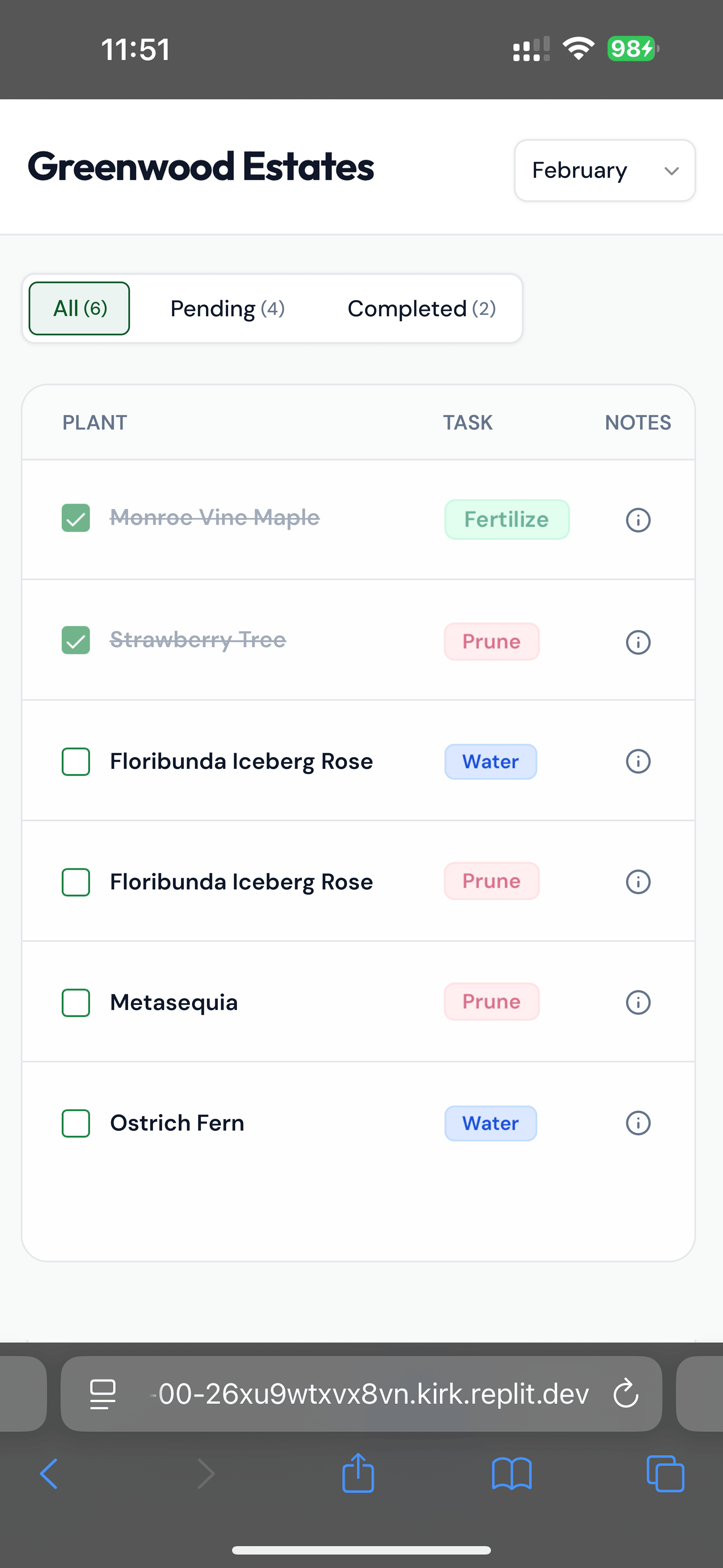
I kept it simple, only showing the plant, task, and notes. The notes open instructions on how to do the task if it’s not clear.
📝 Lessons learned
This was a short, quick project and my first time relying almost entirely on AI. It saved a lot of time, and I was surprised by how many useful ideas it could generate. I’ll definitely use AI as a design assistant to brainstorm and create ideas, even in a traditional UX process.
Vibe coding and UI generation tools work best when you give detailed instructions, or even a design to follow. The initial prompt is crucial: if it’s unclear, you’ll waste time and credits fixing it, so make it specific and detailed from the start.
If you let the tool choose the design “vibe,” it will usually go with generic colors, flows, and patterns. That can make interfaces familiar, but it also makes everything look the same, minimalistic, white backgrounds, rounded edges, even if it doesn’t fit your project. For complex problems, AI tends to adapt existing solutions instead of creating new approaches, which can be misleading.
Some projects still need a tech background. For example, setting up the database was challenging for me, which is why tools like Replit can be helpful. Knowing a bit of CSS and HTML also makes it easier to clean up paddings, colors, text sizes, and other small details.
Sketching or designing a few screens beforehand would have saved time and reduced the number of prompts needed. Using AI to fill gaps, like describing the system, database structure, folders, or information architecture, helps you understand what’s missing and learn faster.